Canvas Builder
Adds styling controls to Drupal Canvas component instances — background color/image/video, spacing, and typography — so editors can build rich pages from reusable SDC components without writing CSS. Style choices are stored as utility CSS classes on the component wrapper and follow Canvas's draft → publish → revision workflow.
Styles are YAML-driven and pluggable: built-in styles are declared in canvas_builder.plugins.yml; other modules can add their own — see Extending.
Features
Layout & navigation
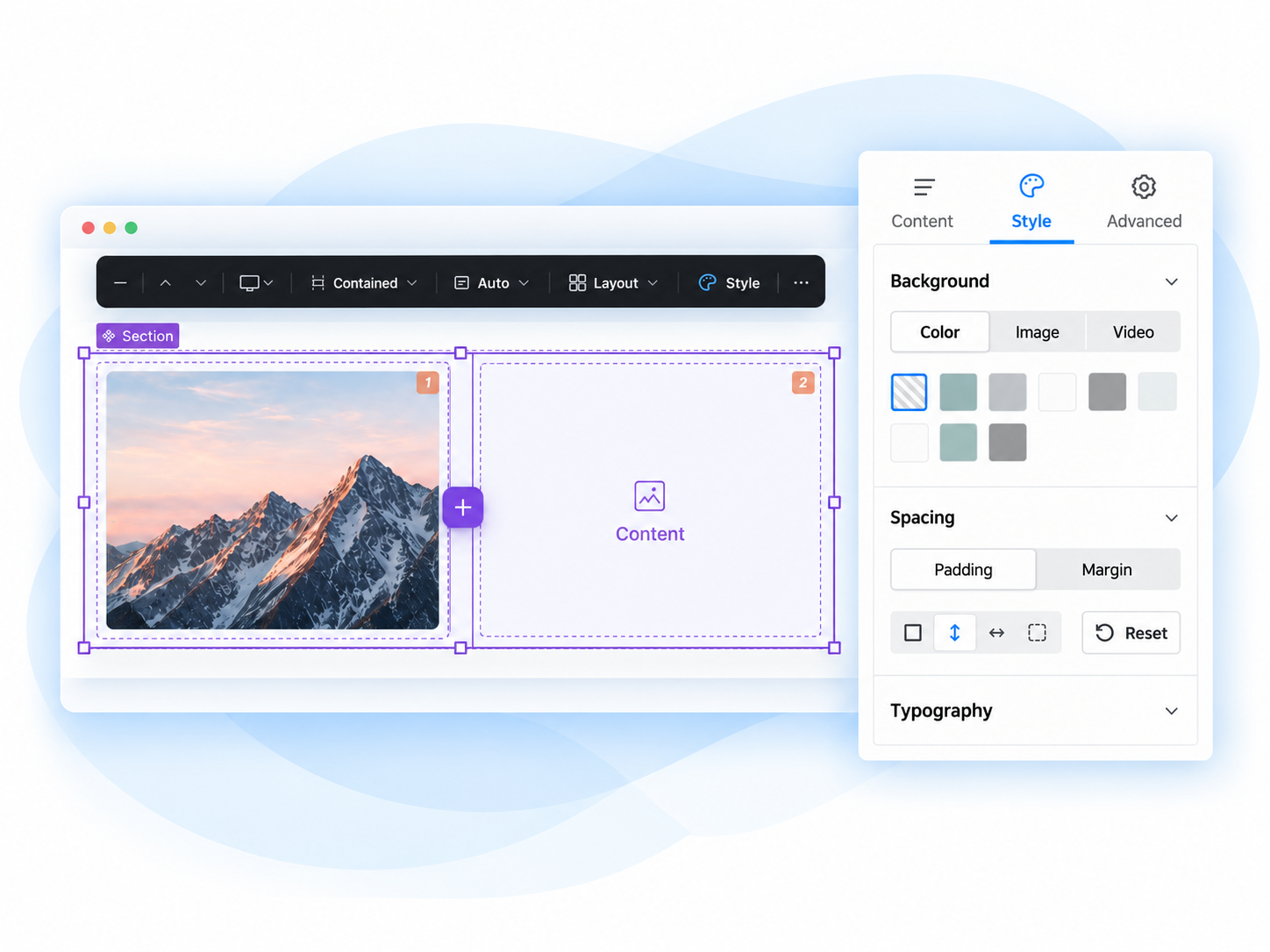
- A floating toolbar for every section — width, height, columns, gap, alignment, and section settings, all edited in place without opening a form. See Toolbar for every chip and popover.
- Section component with built-in responsive columns — a layout
SectionSDC whose column layout is driven by the toolbar (and an empty-state chooser with built-in presets). Each visual column is a realColumnchild component, so content drops into a specific column and drags between columns with native Canvas drag-and-drop; a narrower viewport with fewer columns configured just wraps/stacks rather than removing content. - Double-click to select a parent — Figma/Webflow-style hierarchy navigation: double-click a selected component to jump to the component it lives in, and keep double-clicking to keep walking up. Handy when a child fills its whole area and leaves nothing else to click.
- Hidden-children reveal — select a carousel, accordion, tab set, or any container whose children are hidden/off-screen and a floating badge appears with a slide stepper; each step solo-reveals one child in place and selects it, so you can style content Canvas's own preview would otherwise hide from you. Editor-only and non-persistent — it never touches the layout model or triggers autosave.
Responsive columns, with a live per-viewport breakdown in the Review panel.
Double-click a child to select the component it lives in.
The hidden-children badge reveals carousel slides one at a time for styling.
Styling
- Background — color (utility class), image and video (Media library), with an overlay (color swatch, opacity, blend mode).
- Spacing — padding and margin utility classes.
- Typography — text color and alignment utility classes.
- Animations (optional,
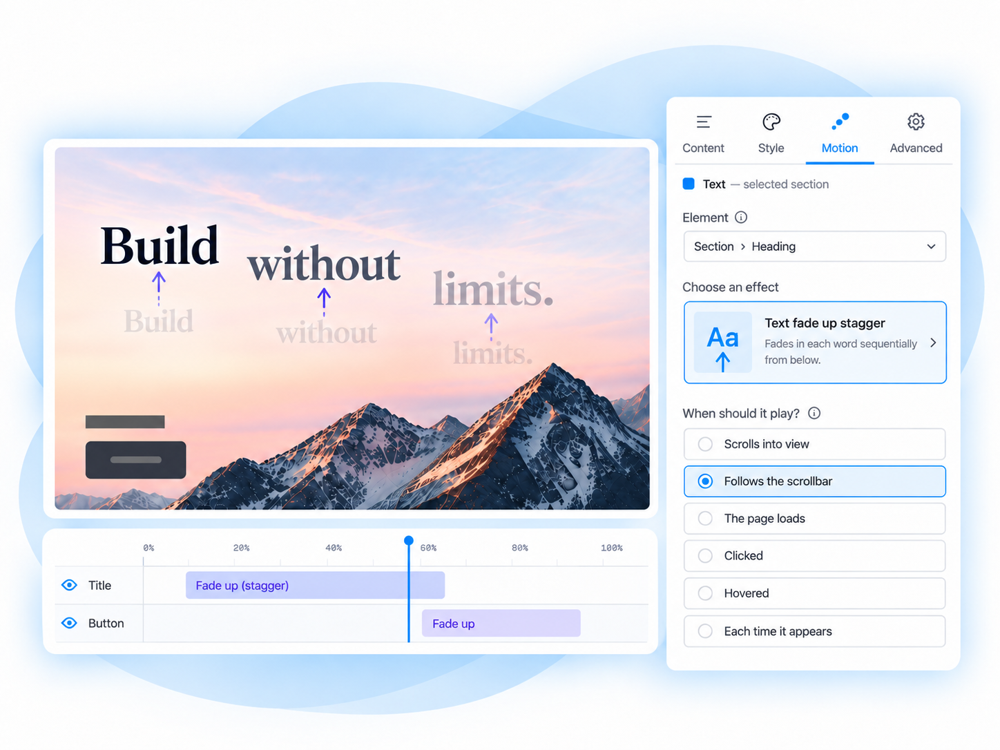
canvas_builder_animate) — scroll-, load-, and click-triggered animations authored from an Animation group in the Style tab and played back on the published page by GSAP + ScrollTrigger. Presets are per-viewport and ride the same draft → publish → revision lifecycle as every other style, with reduced-motion compliance enforced at runtime, not left to the author to remember.
Background — color, image, or video, with an overlay.
Spacing — click-to-cycle padding and margin box model.
Typography — text color and alignment.
Animations — named-target presets (eyebrow, title, body, cta, media) via canvas_builder_animate.
Responsive & multi-framework
- Responsive, per-viewport styling — Mobile / Tablet / Desktop device picker (Large Desktop opt-in); every style is stored per viewport with a mobile-first cascade. Framework-agnostic: stores author-configured class strings only.
- Framework profiles — ship and switch between Custom (CSS variables, default), Bootstrap 5, and Tailwind class sets. See Frameworks, Bootstrap, Tailwind.
Editing workflow
- Prop grouping — SDC props organized into Content / Style / Advanced tabs automatically, driven by a YAML annotation on the component — no custom form code needed.
- Enable/disable any style plugin — globally, or overridden per component (a card can offer spacing but not background media) — with zero JS/CSS shipped for a disabled plugin.
- Revision-aware — a style change is a draft until the page is published, then it is a new revision.
- Travels with content — styles carry through duplicate, copy/paste, and Canvas patterns.
- Copy Styles / Paste Styles — right-click any component → Copy Styles, right-click another (any type, any layout) → Paste Styles to replace its whole style bundle with the copied one. ⌘⇧C / ⌘⇧V do the same on the currently selected component.
Props auto-organize into Content, Style, and Advanced tabs.
Turn off a style feature to hide it from the component editor.
Copy Styles / Paste Styles in action
Right-click a styled component and choose Copy Styles:
Right-click the target — any component, any layout — and choose Paste Styles:
The target now has the exact same background, spacing, and typography — replacing whatever styling it had:
Extending
- Extensible — add styles, groups, or new style types from your own module.
- AI-assisted section building (optional,
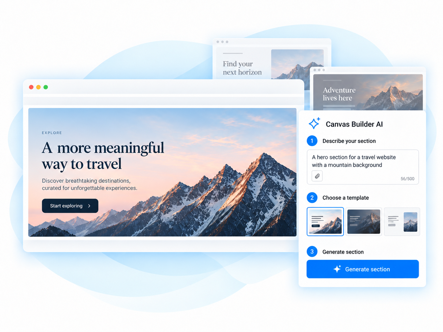
canvas_builder_ai) — editors describe a section in plain language and it's built from your approved components, governed and validated server-side against the same style plugins and permissions as manual editing.
Describe a section or page and let AI build it from your approved components.
Where to go next
- Toolbar — the floating section toolbar: every chip, popover, and backing field.
- Styles — a closer look at the Background, Spacing, and Typography panels.
- Extending — add styles, groups, or style types from your own module.
- Events — the client JS API and
cb:*event contract. - Frameworks — framework profiles and layout class maps.
- Frontend — front-end rendering details.
- Animation — scroll-, load-, and click-triggered animation.
- AI page building — describe a section or page and let AI build it.
Requirements & installation
- Drupal ^11.2,
drupal/canvas^1.4,drupal/media
composer require drupal/canvas_builder
drush en canvas_builder
Configuration: Administration → Configuration → Content authoring → Canvas Builder (requires the Administer Canvas Builder permission). Full details, including the optional AI-assisted section builder, are in the project's README.
Issues and patches are welcome in the project issue queue.