Styles
Style controls a component's look — background, spacing, typography. For a Section's band and column layout (width, height, gap, alignment), see Toolbar.
Every component instance gets a Style tab with a fixed set of style
groups — Background, Spacing, Typography — plus Animation
if the optional canvas_builder_animate submodule is enabled (see
Animation). Each group is YAML-driven and stores author-
configured utility class strings, never generated breakpoint grammar, so
the same panel works whether the site runs Bootstrap, Tailwind, or a custom
framework — see Frameworks.
Every value here is per viewport, resolved mobile-first (a viewport with no entry inherits the nearest narrower one), and rides Canvas's own draft → publish → revision lifecycle. Switching the device picker re-points every control to that viewport's stored value.
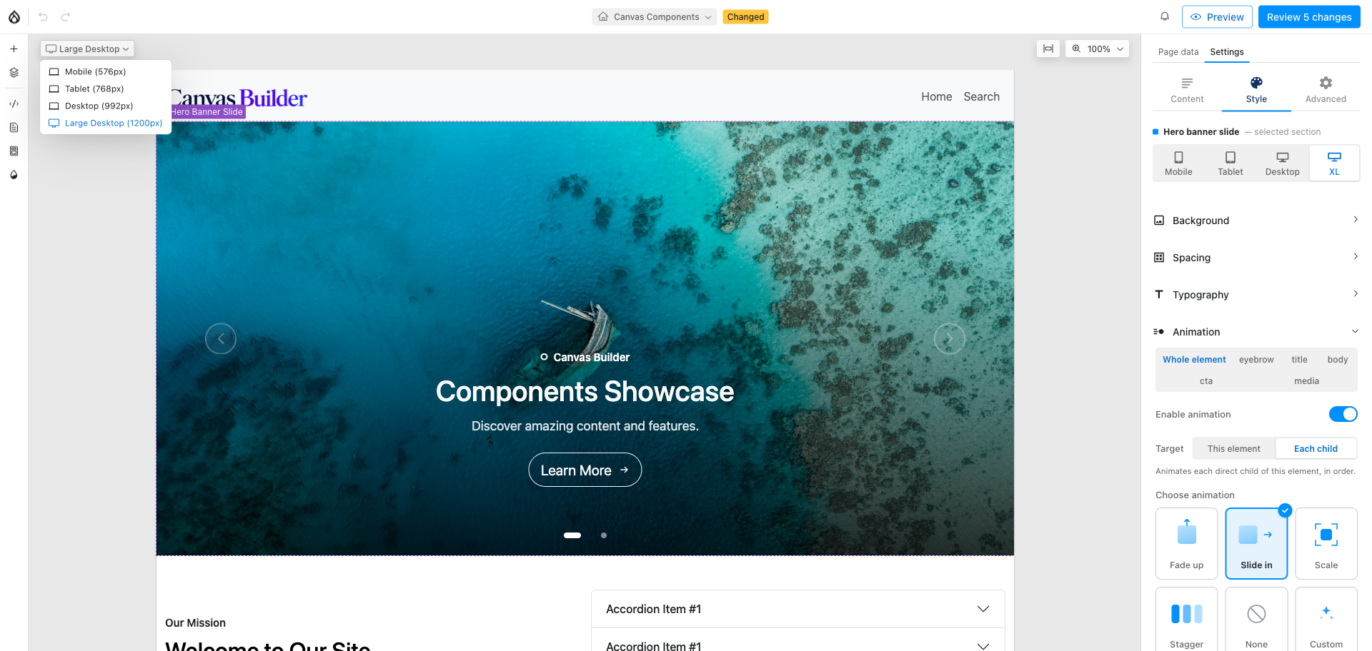
The device picker in the toolbar — every style panel below re-points to it.
Background
Color, image, or video, each on its own tab, plus an overlay over image/video.
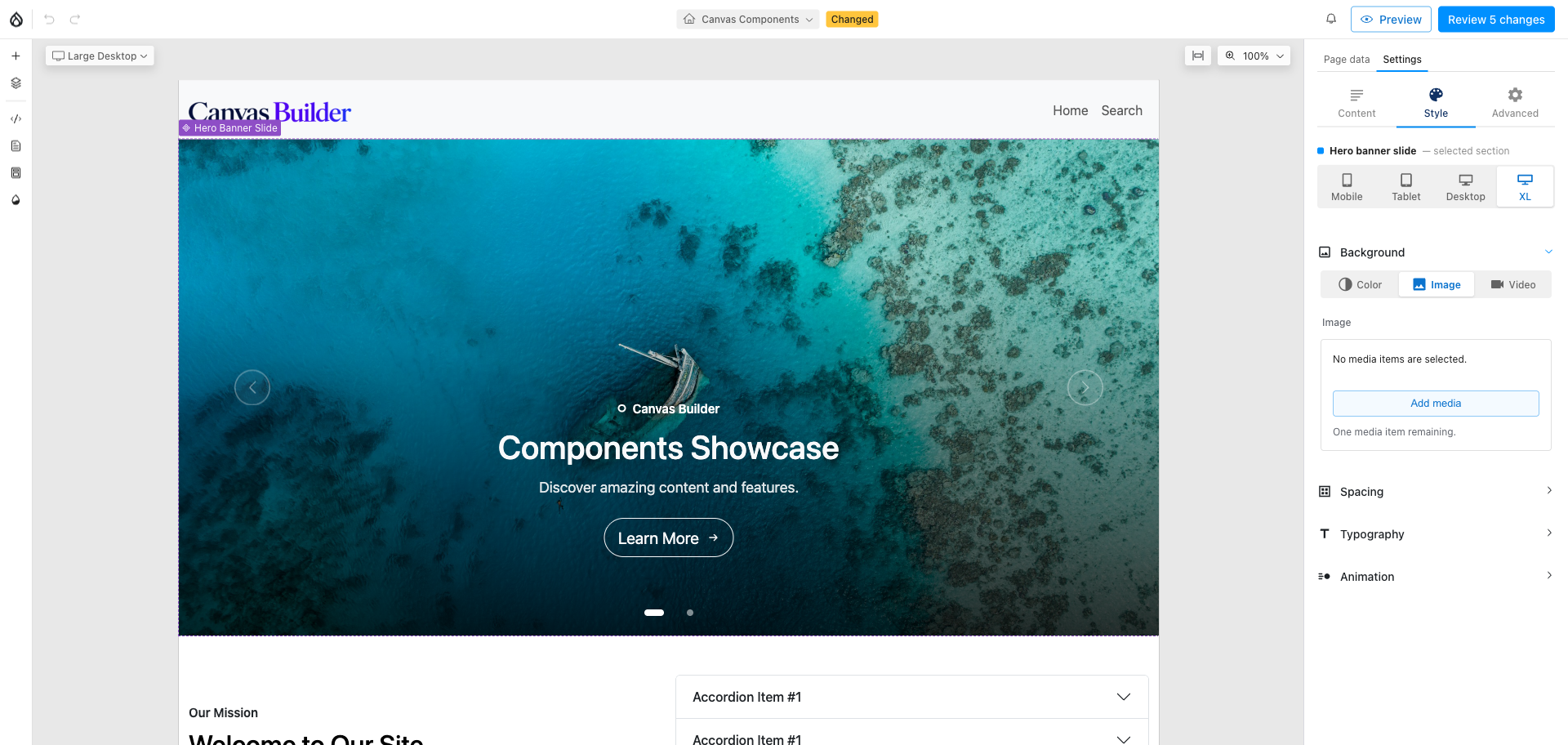
- Color — a swatch-backed dropdown (
bg_color_classes) of utility classes. - Image / Video — pick media from the Media library
(
background_image_bundles/background_video_bundlescontrol which bundles are offered). - Overlay — color, opacity, and blend mode over an image or video, so a photo can sit under readable text without a second component. Overlay values are per viewport too — a photo can go clean on mobile and gain a dark overlay at desktop.
Only one bg type — color, image, or video — is active per viewport at a time; picking a new tab replaces the previous one for that viewport rather than layering them.
Spacing
Padding and margin, each as an interactive box-model diagram rather than a plain class dropdown.
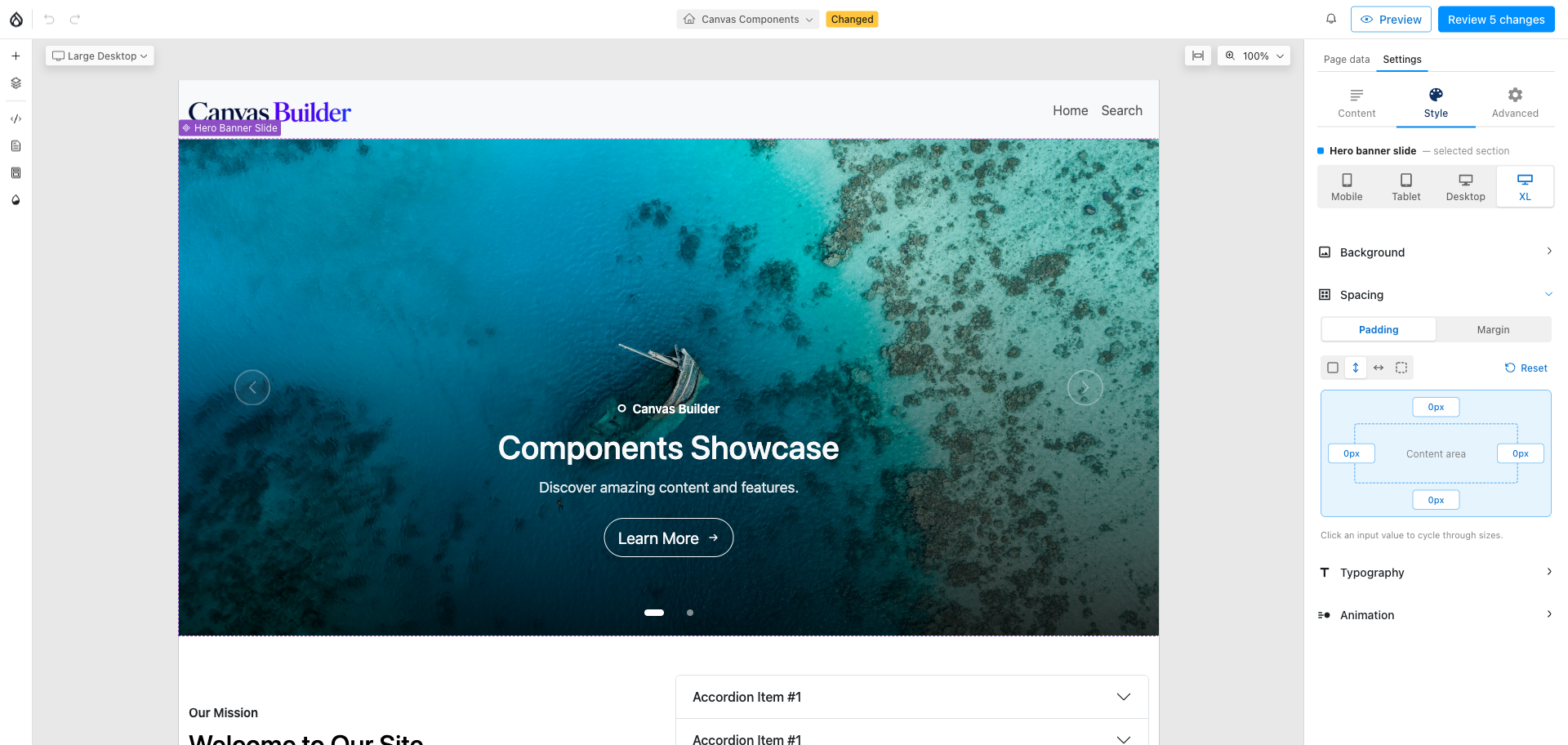
- Pattern buttons — All sides / Vertical / Horizontal / Custom, plus Reset — choose how many independent values you're setting before you touch the diagram.
- Click-to-cycle badges — each side of the box shows its current size in px; clicking a badge steps to the next configured size, so no dropdown or typing is needed for the common case.
- Center-block — on Margin only, a toggle for the common
margin-inline: autopattern.
Per-side classes (pt-*, pr-*, pb-*, pl-*, or the axis tokens px-* /
py-* when opposite sides match) are derived in the browser from the
single configured class list (padding_classes / margin_classes) using the
framework's side-letter map — a Bootstrap site derives pt-/pe-, a Tailwind
site the same pt-/pr-. Because those per-side names are generated at
runtime, they appear in no source file a Tailwind build can scan; the admin
Tailwind Safelist export (see Frameworks)
includes them so a purge build doesn't drop them silently.
Typography
Text color and alignment, applied to the component wrapper.
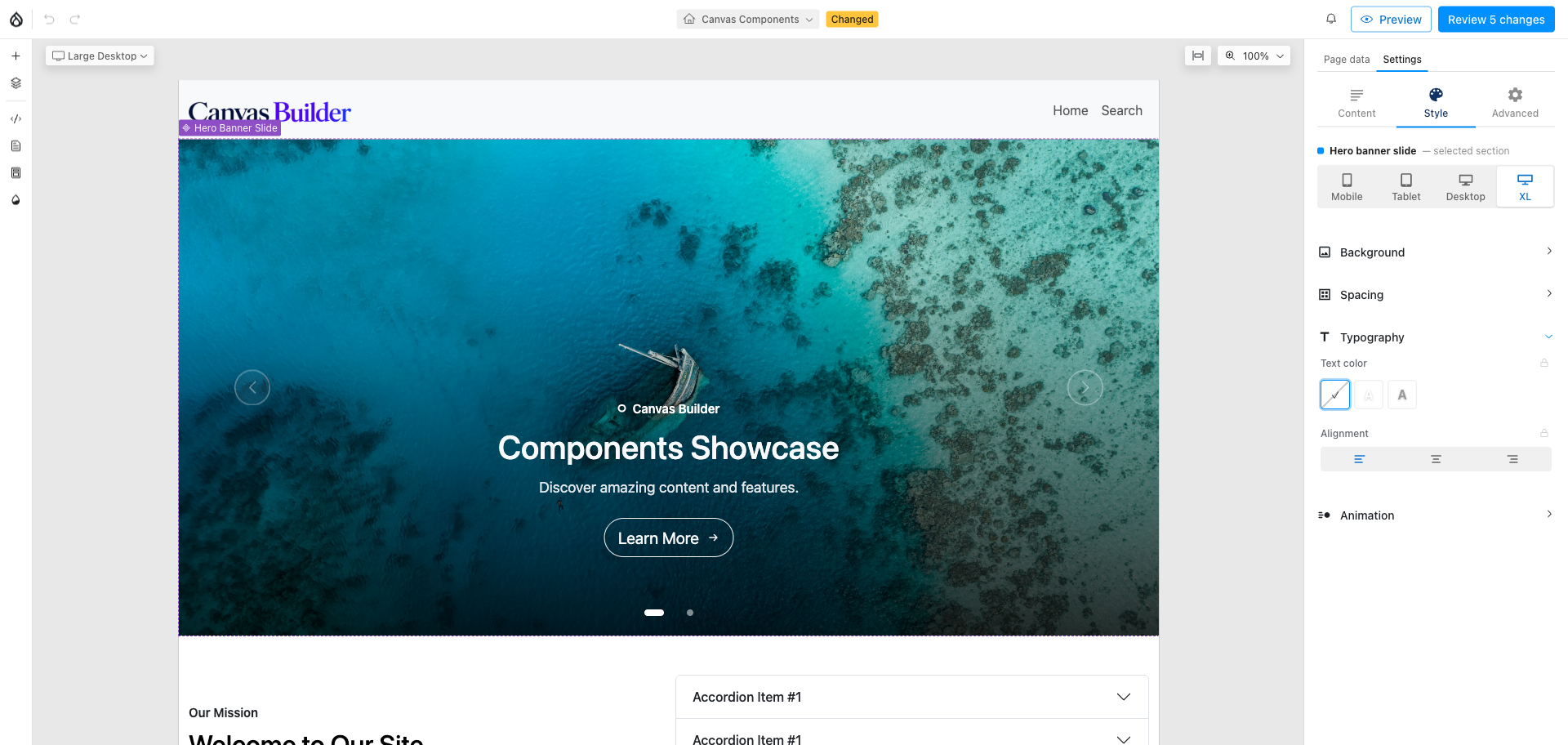
- Text color — a swatch-backed dropdown (
text_color_classes), the same control style as Background's color tab. - Alignment — icon buttons (
text_align_classes) for the configured alignment options.
A fully-justified option is deliberately not shipped by default — it fails WCAG 2.1 SC 1.4.8 (Level AAA) for body text — but if your site's admin adds one, the panel surfaces an in-context note explaining the trade-off rather than silently allowing it.
Enable/disable any style
Every group, tab, and child above can be turned off — globally, or per component (a card can offer Spacing but not Background video) — with zero JS/CSS shipped for a disabled option.
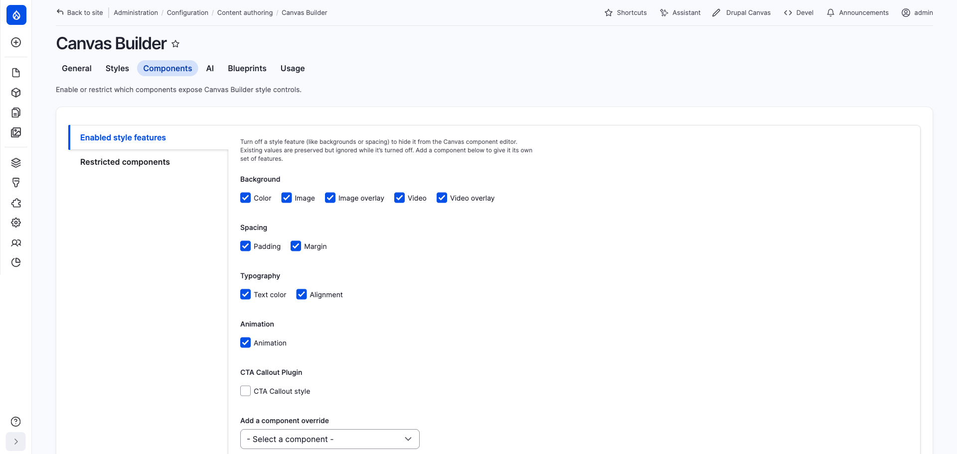
Configuration → Content authoring → Canvas Builder → Styles
Extending
Background, Spacing, and Typography are the built-in set, but they're
defined the same way a contrib or custom addition would be — YAML plus a
settings_key resolving to a config-stored option table. Adding a new
option to an existing group, a whole new group, or an entirely custom
widget is covered in Extending.