Animation
Scroll-, load- and click-triggered animation, authored per component from the
Style tab and played on the published page by GSAP. Ships as the optional
canvas_builder_animate submodule — enable it and an Animation group
appears alongside Background, Spacing and Typography.
Everything here is per-viewport and rides the same draft → publish → revision lifecycle as every other style — nothing is a separate content model.
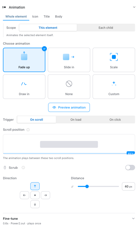
The panel
Target tabs
The row of tabs at the top of the group chooses what animates:
- Whole element — the component's own wrapper, or each of its children.
- A named region — one tab per
data-cb-anim-targetmarker the component's own template offers. See Named targets.
Each tab holds a completely independent animation: its own trigger, timing, easing and scroll bounds. They run concurrently. A CTA can draw its icon in on scroll while its text rises on click.
Scope
Under the Whole element tab only:
- This element — animate the component's wrapper as one object.
- Each child — animate the things inside it, in sequence.
"Each child" descends past a component's single structural root, so it finds the real siblings rather than the one wrapper the SDC happens to emit. Named tabs have no Scope control — their identity already is the target.
Presets
A preset is a named bundle of values, not a label. Picking "Fade up" sets direction, distance, opacity, duration and easing together. Only the preset's id is stored, so retuning a preset in settings updates every component using it.
Shipped: Fade up, Slide in, Scale, Stagger, Draw in, None and Custom. Presets are administrable — that set is a starting point, not a fixed vocabulary. See Settings.
None is the off state. There is no separate enable switch: choosing None is how you turn an animation off, and a component set to None carries no animation config at all — no attribute on its wrapper, and no GSAP downloaded for that page. Everything below the preset grid dims while None is selected; the grid itself stays live, so you can always choose your way back out.
A preset the component cannot support is shown disabled with the reason rather than hidden — see When a preset is unavailable.
Trigger
On scroll, On load, or On click.
On scroll reveals a viewport diagram with two draggable markers: where the animation starts, and — with Scrub on — where it finishes. Scrub ties progress directly to scroll position, like a video scrubber, instead of playing once when the trigger fires.
Fine-tune
Timing, easing, opacity, repeat and once-per-session live behind a
Fine-tune disclosure, closed by default, because the preset has usually
already decided them. Closed, it carries a one-line recap of what it holds —
0.6s · Power2.out · plays once — so you can read the state without opening
it.
It opens by itself when it would otherwise hide a value you set that the recap does not name.
When a preset is unavailable
Some presets need something from the component itself. Draw in animates the length of a stroke, so it needs artwork drawn with strokes — a filled icon has no line to draw.
Those two cases are treated differently on purpose:
- A requirement you can satisfy from the panel — Stagger needing more than one element — just hides the tile. Pick another target and it returns.
- A requirement about the component's markup, which the panel cannot change, leaves the tile visible but disabled, with the reason under the grid. Silently removing it would send you hunting for something that was never coming back.
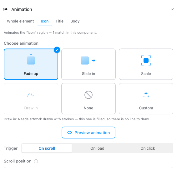
Draw in on a filled icon: the tile stays, dimmed, and says why.
Most icon sets are filled, not stroked
Bootstrap Icons, and any icon built from filled paths, cannot be drawn.
Draw in needs a stroked family — Feather, Lucide, Heroicons outline, or
hand-authored SVG carrying stroke.
Controls appear only when they can act
A control that cannot do anything is not rendered, rather than greyed out. Scroll position and Scrub exist only for a scroll trigger. Stagger exists only when the target resolves to more than one element. Repeat delay exists only when something repeats.
Nothing is lost by hiding: a stored value stays stored and reappears intact when it becomes applicable again.
Named targets
A component author marks an animatable region in their own Twig. There is no schema to declare, no annotation to maintain, and no PHP involved:
<h2 data-cb-anim-target="title">{{ title }}</h2>
<div class="card-body" data-cb-anim-target="body">{{ body }}</div>
The Animation panel scans the live preview for those markers and offers a tab
per name. Names are sentence-cased for display only — cta-button reads
"Cta button" — while the marker and the stored value stay verbatim.
Rules worth knowing:
- A marker belongs to the nearest enclosing component, so a nested
component's own
data-cb-anim-target="icon"is never captured by its parent. - The same name may appear several times in one component. Those elements animate together and honour the Stagger control.
- Storage is by slot index (
anim_duration__0), so re-pointing a configured group at a different marker keeps its values. - Renaming a marker in Twig does not delete its stored animation. The panel keeps listing the old name, greyed, until you re-point or clear it.
max_named_targets(default 6) caps how many one component may configure at once.
Choosing names
Names are yours — the panel shows whatever it finds. A small, reused vocabulary travels better than a bespoke one per component, because an editor learns it once and a preset like Draw in behaves predictably wherever it appears:
eyebrow · title · subtitle · body · icon · media · caption ·
count · cta
Mark only the regions worth animating individually. A component that's one block of content needs no markers — Whole element already covers it. A container whose children are separate components needs none either; each child carries its own.
Per-viewport behaviour
Every animation value is stored per viewport and resolved mobile-first: a viewport with no entry inherits the nearest narrower one. Switch the device picker and the panel re-points to that viewport's values.
At playback the runtime hands each breakpoint window to gsap.matchMedia(),
which reverts a window's tweens automatically when the browser crosses out of
it. There are no @media rules and no generated breakpoint class grammar.
Reduced motion
Suppression under prefers-reduced-motion: reduce is a WCAG 2.2.2 obligation
the runtime always honours. It is shown in the panel as a locked indicator,
not a switch, and there is no configuration key to turn it off. A visitor who
asks their system for less motion sees the content in its natural state.
Content is never left invisible. Nothing is hidden by CSS — the from-state is applied by GSAP only — so a blocked GSAP, a reduced-motion visitor, or a tween that throws all end with the element visible.
Settings
Configuration → Content authoring → Canvas Builder → Styles → Animation
- Presets — the vocabulary offered in the panel. Each carries a label and
the bundle of values it applies, plus two optional keys:
requires— a detector the target must satisfy for the preset to be offered.svgneeds artwork with strokes;multipleneeds the target to resolve to more than one element.library— a Drupal library the preset needs in order to play, such asgsap/drawsvg.
- Easings and Repeat options — the choices the panel lists.
- Ranges — the slider bounds (max distance, max delay + duration, stagger and repeat-delay ceilings and steps).
- Defaults — the value every unset key falls back to, site-wide.
A component's effective default is the site default overlaid with the preset it chose, so what the panel shows is what will actually play.
For developers
Storage
Every value rides the existing classes bucket of the component's style
bundle under an anim_ key prefix (anim_enabled, anim_preset,
anim_duration, …) — not a new field, not a new State store. Read them back
at render with getComponentClassViewportMap($uuid, 'anim_duration'), never
with getComponentPluginClasses(), which flattens the per-viewport detail
away.
No anim_* key ever reaches the wrapper's class attribute. The base
module's prerender strips the prefix alongside the overlay keys and emits the
config as a data-cb-anim JSON blob instead.
What the base module gains
Exactly two things, both in src/Render/CanvasBuilderTrustedCallbacks.php:
the anim_* strip, and a conditional runtime library attach. No manager
change, no new core service, no key in canvas_builder.settings. Uninstalling
the submodule leaves the base module fully functional, with orphaned anim_*
values inert in storage. PortabilityContractTest pins this.
Runtime
GSAP loads only for pages that actually carry animation config, and
ScrollTrigger only when some enabled viewport's resolved trigger could be
scroll. The runtime stays inert on the live editing canvas — the editor
paints its own preview there — and plays on Page Preview and the published
front end.