AI page building
Describe a page or a section and have it built from your approved
components, with your real content. Ships as the optional
canvas_builder_ai submodule and mounts as a Create tab in the Canvas
editor's right panel.
Nothing generates markup. The AI picks from a governed catalogue of the components you already have, and every plan it produces is validated server-side before a single node reaches the page.
Where it lives
There is no floating launcher — the Build UI is a Create tab, a real peer of the panels you already use.
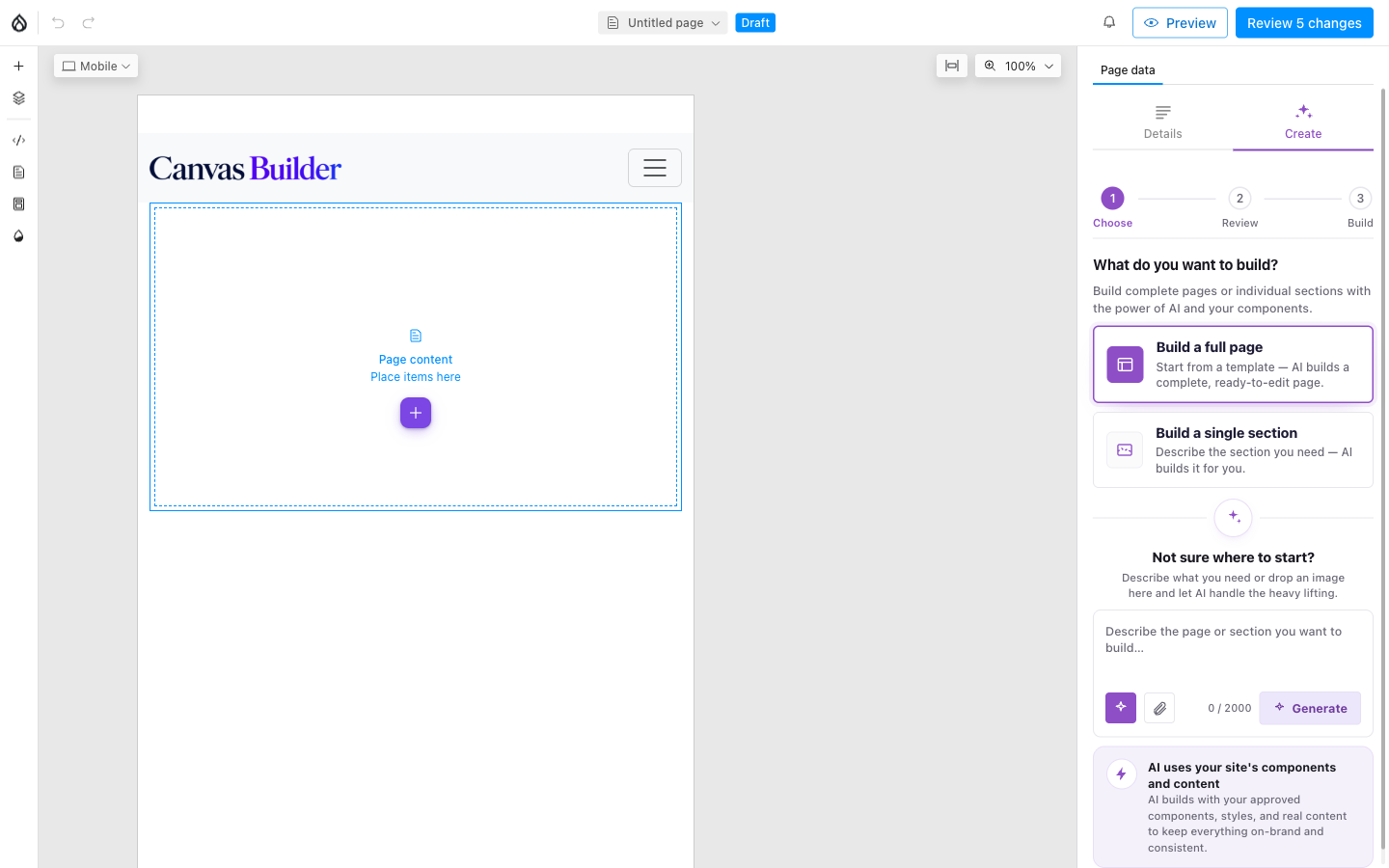
Nothing selected: Create sits next to Details in the Page data panel.
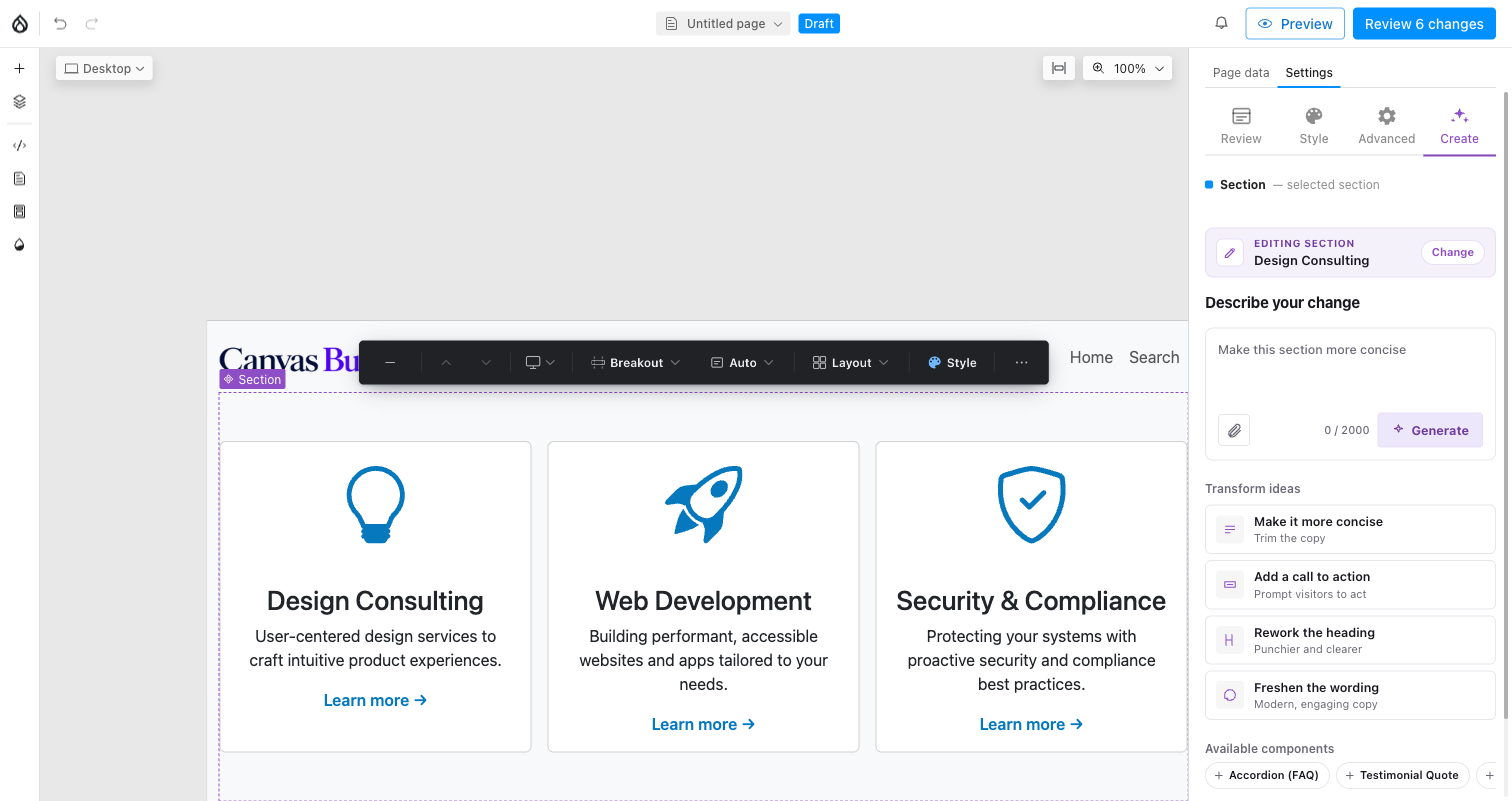
A top-level section selected: Create joins Review/Style/Advanced and switches to transform mode.
Land on any Canvas page and Create is there immediately, next to Details in the Page data panel. Select a top-level section and the same tab appears in its settings panel — alongside Review/Style/Advanced — but now it modifies the section instead of creating a new one. Select a nested component (a card in a grid, a slide in a carousel) and the tab disappears, keeping that component's own props uncluttered.
Build a single section — step by step
Describe one section and the AI returns up to three takes, built from your approved components. Four screens, in order:
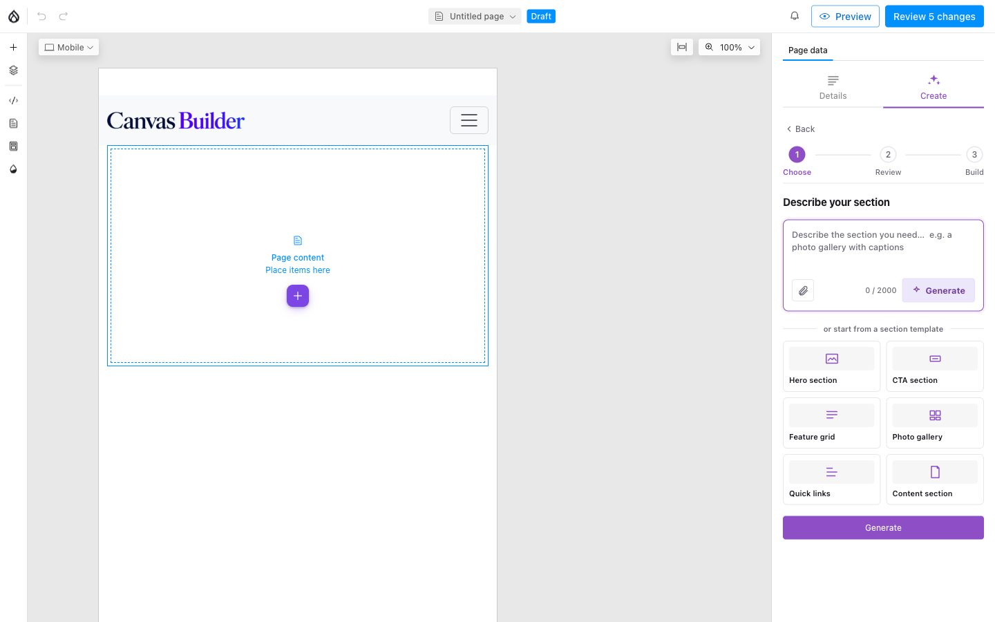
1. Describe. Type a prompt, or start from a template and edit the result.
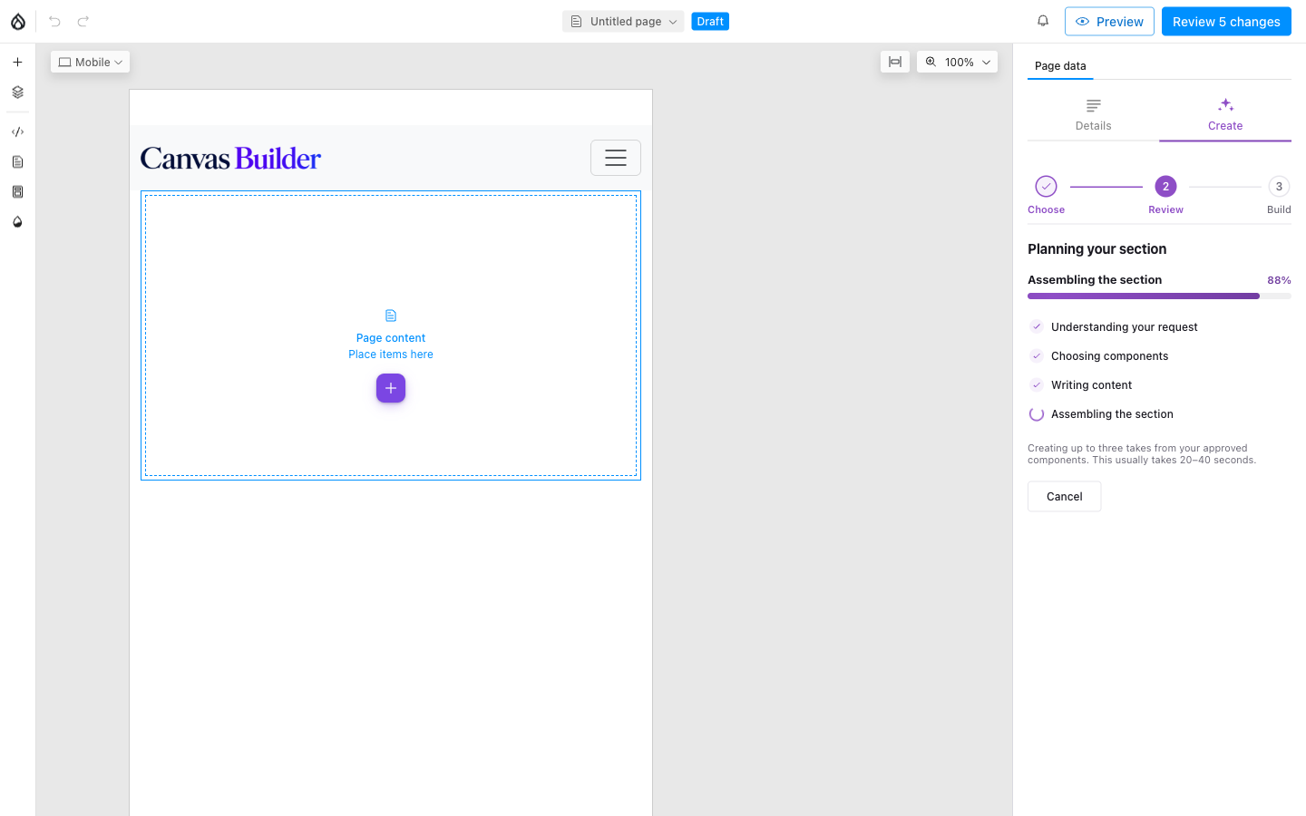
2. Generating. A short checklist shows what's happening; this usually takes 20-40 seconds.
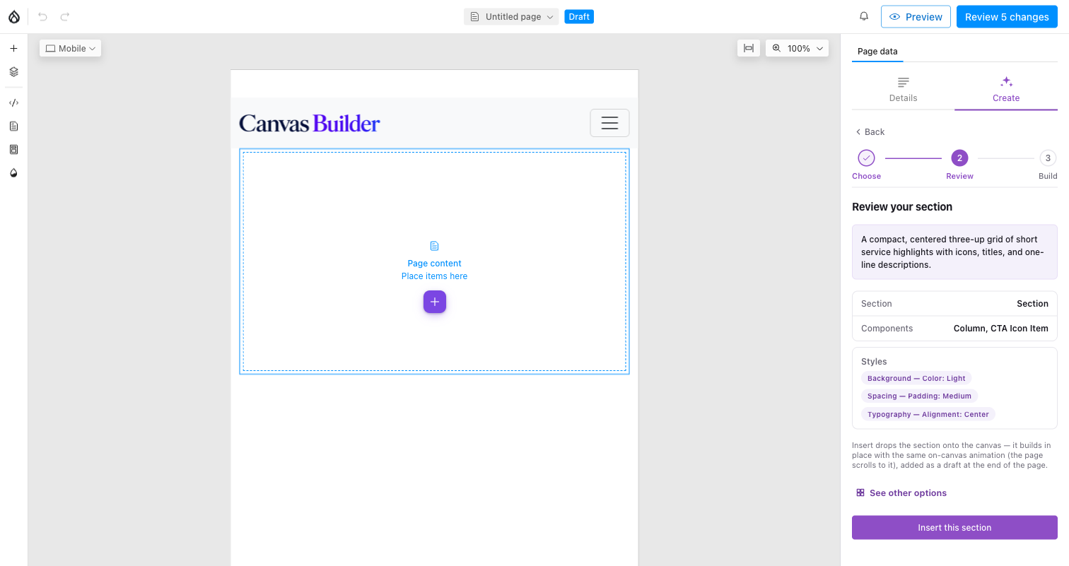
3. Review. Facts only — label, component count, style chips — plus See other options if you asked for more than one take.
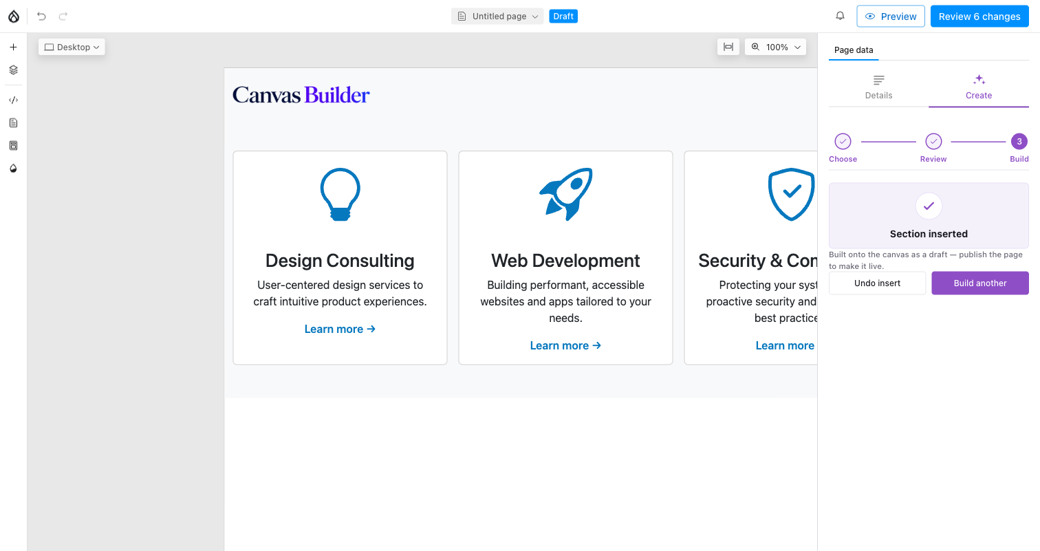
4. Inserted. The section lands on the canvas as a draft, with a one-click undo.
It lands after the current selection, or at the end of the page if nothing top-level is selected.
Modify an existing section instead
Select a top-level section and describe a change ("make this more concise", "add a call to action") instead of starting from scratch — the same Describe your change field, plus one-tap transform ideas and a list of Available components to drop straight in. The AI sees the section's current content and is asked to preserve its intent, not replace it wholesale.
Build a full page — step by step
Starts from a blueprint rather than a blank prompt, because a page is a sequence with structure, not one big paragraph of instructions — see Blueprints for what a blueprint actually is.
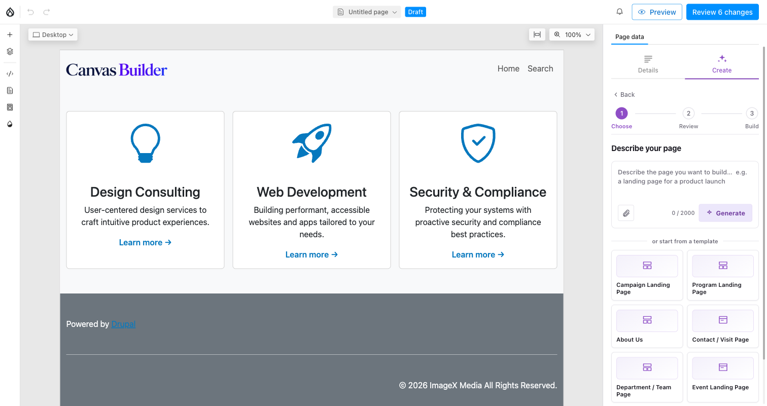
1. Choose. Describe the page freely, or pick one of the shipped blueprints. Continuing auto-picks its recommended variation — you can change that later.
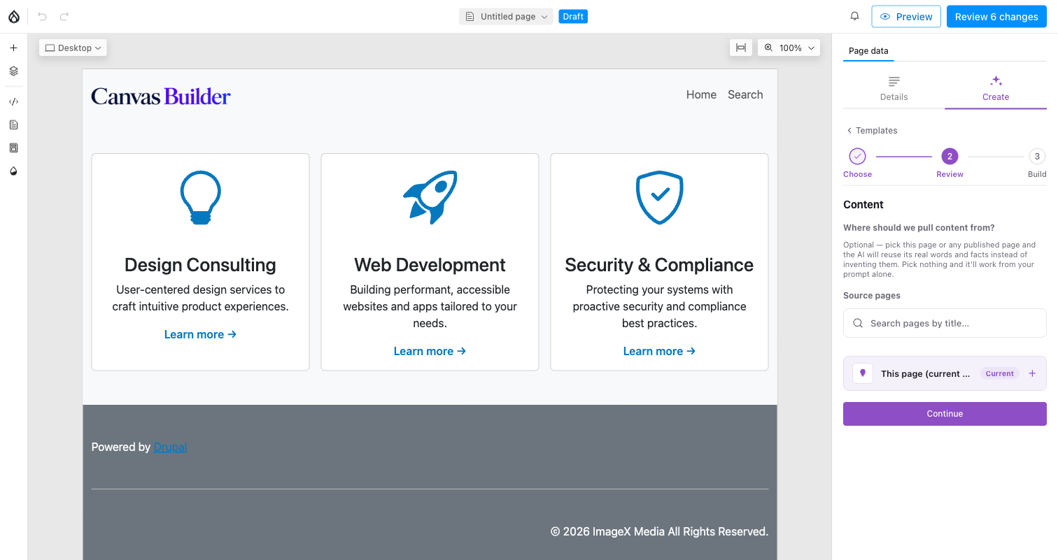
2. Content. Optionally ground the build in real pages — the AI reuses their actual words and images instead of inventing them.
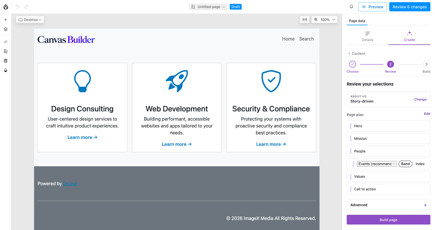
3. Review the plan. The chosen blueprint + variation, and the resulting section order — reorder, drop sections, or override how a data-driven section (like "People") resolves.
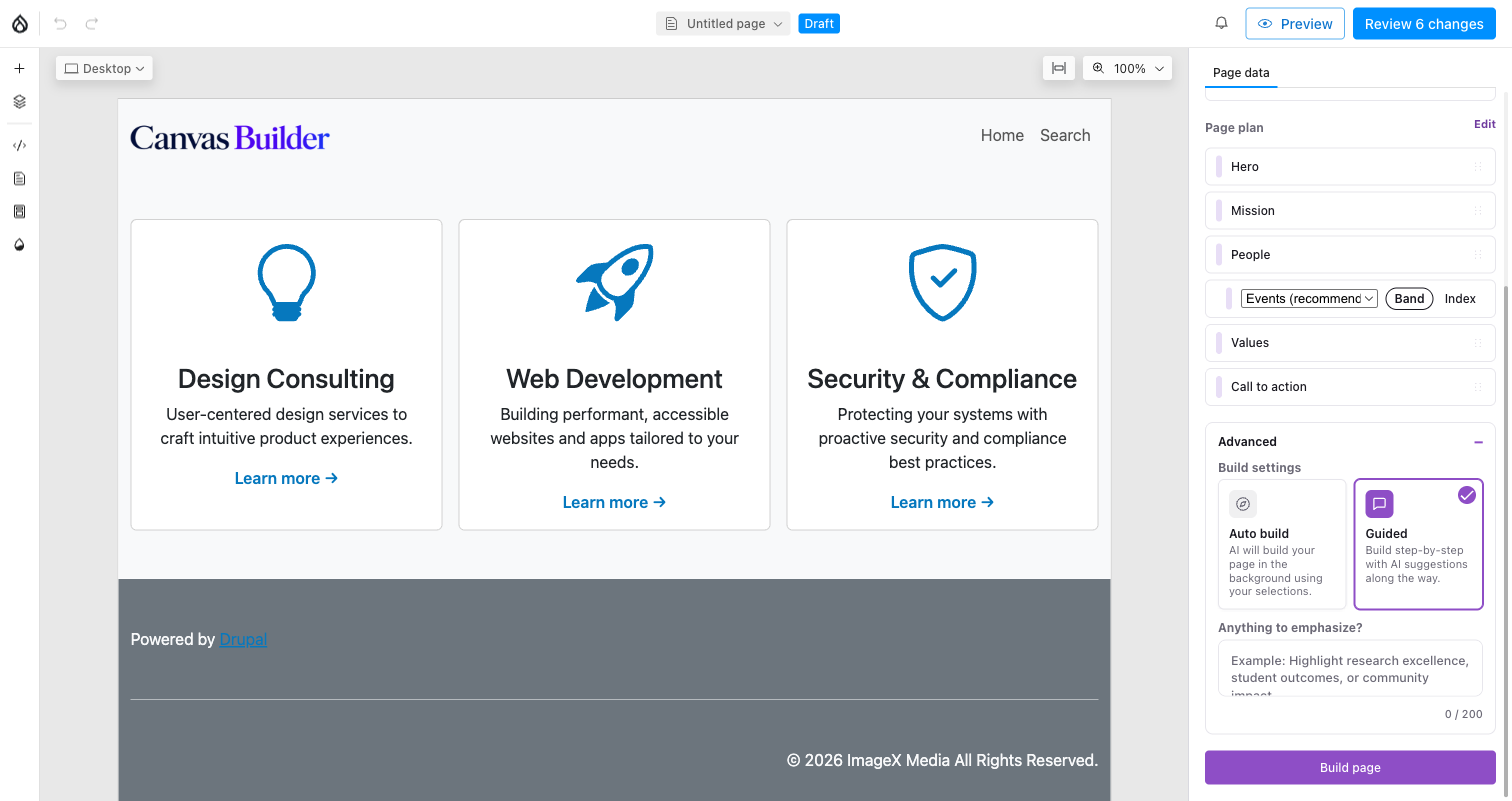
3b. Build settings (under Advanced). Auto builds everything in the background; Guided stops after each section for your approval.
Clicking Build page may first ask you to confirm anything that looks data-driven, then starts building:
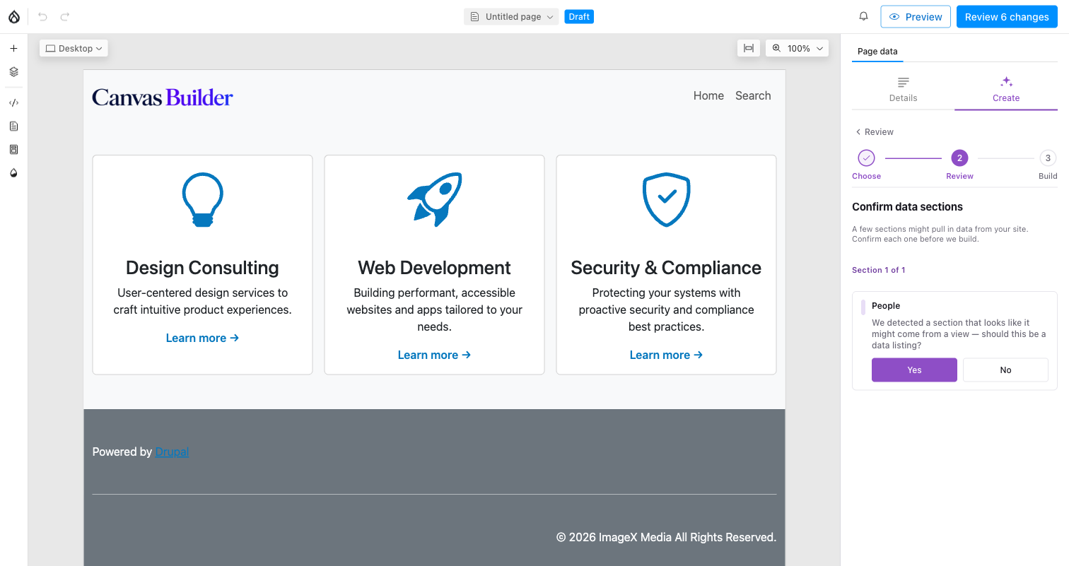
A quick sanity check for any section that looks like it should pull from a View, before the build spends a call on it.
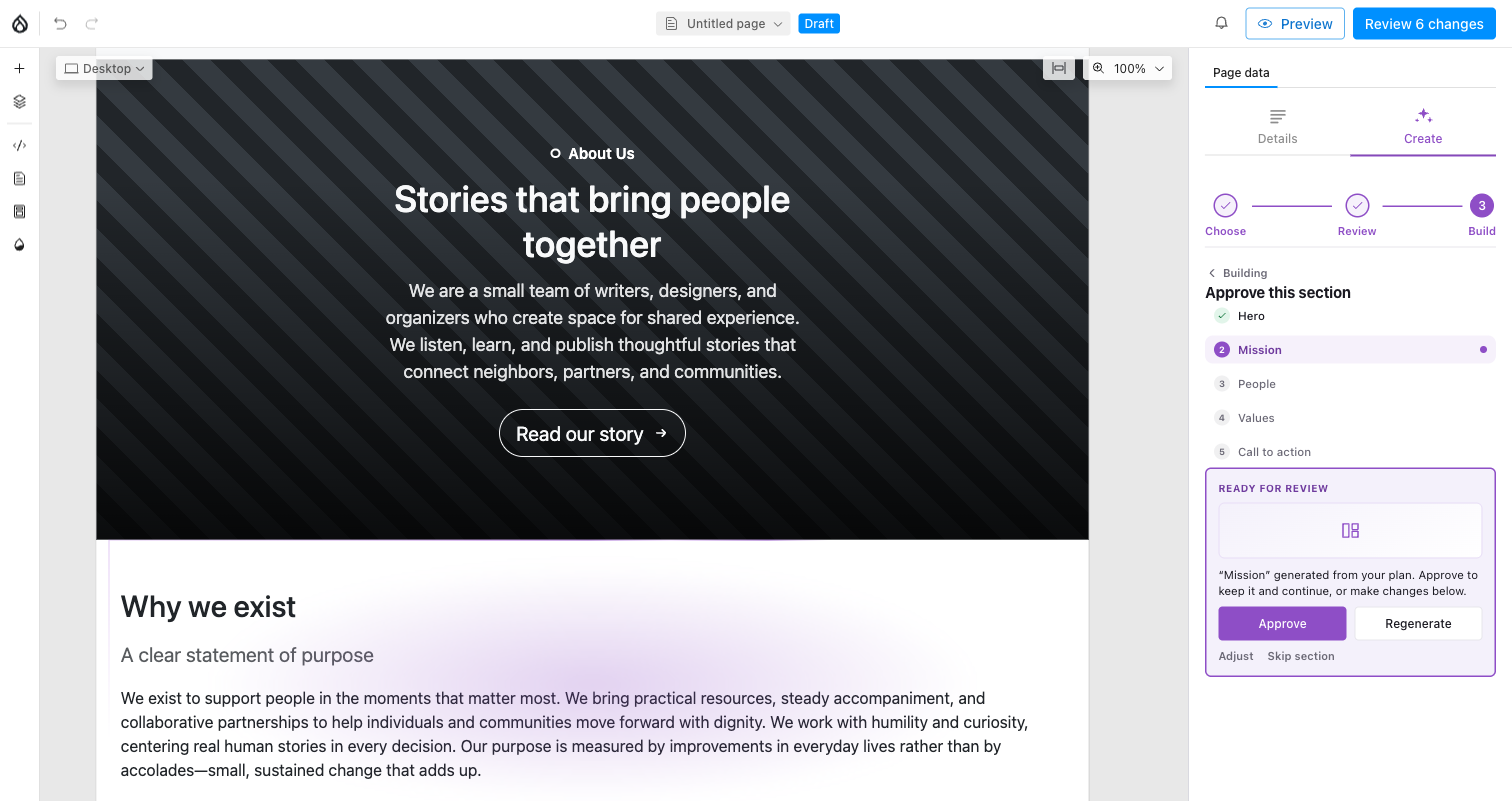
Guided mode: each section lands with a build-animation flourish, then waits for Approve, Regenerate, Adjust (with a note), or Skip.
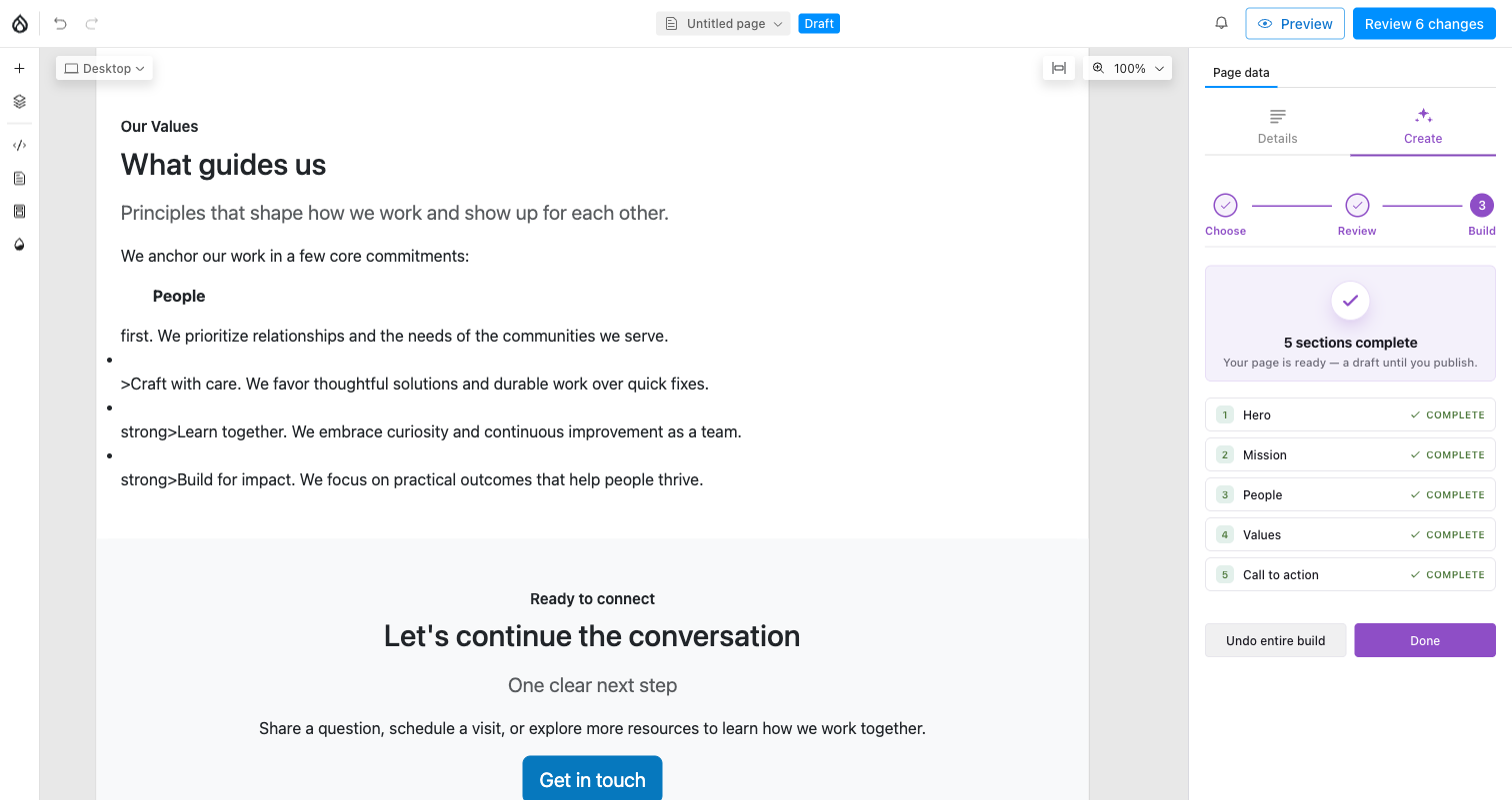
4. Done. Every section's status, plus a single Undo entire build that restores the pre-build page exactly.
Auto skips the per-section checkpoints and runs straight through the same sequence — useful once you trust the plan from Review and just want the page built.
Blueprints
A blueprint is a page recipe — a config entity, exportable and diffable like any other. Six ship in-box: About us, Campaign landing, Contact & visit, Department page, Event landing, Program landing.
The portability rule is the important part:
Blueprints never name your components
A blueprint declares abstract capabilities — hero, card_grid,
stats, faq, cta, people — not SDC machine names. A resolver maps
each capability to whatever your site's approved component set can
actually provide. The same blueprint works on any site, with any theme,
with any component library.
Blueprint
├── category        selection grouping
├── best_for[]      hints that match a request to this blueprint
├── sections[]      the section pool — the hard structure
│   ├── intent              what the section is for
│   ├── capabilities[]      semantic archetypes, from an extensible registry
│   ├── fallback_capabilities[]
│   └── optional            may be pruned if it does not fit the request
└── variations[]    ordered arrangements + the soft steering
    ├── tone        e.g. "Urgent, action-first"
    ├── emphasis    how to build this variation
    └── section_order[]
Sections are the hard rules; variations are the steering. A variation draws from the blueprint's own section pool — it can reorder and omit, but never invent a new section. One call-to-action may echo earlier in the order, which is how "CTA early and often" landing pages work without opening the door to arbitrary duplication.
In the Review screenshot above, "About Us / Story-driven" is the blueprint
and the variation the Choose step auto-picked — the Change link
reopens the variation picker without losing your content-source choice, and
the Page plan list below it is exactly that variation's section_order,
rendered as a draggable, editable list rather than a config file.
Capability resolution
Each section resolves against your approved components and reports a status the Review step shows you before anything is built:
| Status | Meaning |
|---|---|
| 🟢 Green | A primary capability matched a real component. |
| 🟡 Amber | Resolved through a fallback, or a custom one-off — best effort. |
| 🔴 Red | Nothing on this site can build it. |
Capabilities come from a registry, not a hardcoded list — adding one is a config entry plus an optional hook, not a core change.
Content
The full page build's Content step (screenshot above) decides what the copy is made of:
- AI copy — written for the page.
- Placeholder — structure now, words later.
- Site name & tagline — the safest real-content source.
Grounding goes further: pick published pages as reference material and the build uses their actual text and images. The picker searches your pages, and one tap adds the page you are editing.
Two things worth knowing about grounding:
- The client sends only references, never content. The server resolves them, so grounding stays server-authoritative.
- Grounded material is framed to the model explicitly as data, not instructions, so nothing a referenced page happens to say can redirect the build.
Images are found by walking entity reference fields down to a media entity with a populated image field. A plain image field directly on the node, or a media item only embedded inline in a text field, is not visible to that walk.
Governance
This is the part that makes the feature safe to turn on.
- An allowlist, not the whole catalogue. Only components you approve can be used.
- Server-side validation. Every plan is validated against the real component schemas before it becomes page content. An invalid plan is rejected, not repaired into something plausible.
- Structural guardrails. Caps on sections per page, components per page, and slot nesting depth.
- Two-layer kill switch. The feature can be disabled wholesale, and each workflow (section transform, content grounding) toggles independently.
- Placeholder URLs are stripped. Stock-photo placeholder services are rejected as fake content rather than silently shipped.
- Permissions. Building requires the Canvas edit permission plus entity update access on the page itself.
Cost
Token usage is recorded per generation and surfaced on a usage dashboard, with per-model input/output pricing configurable in settings. A full-page build is one model call per section, not one call for the page.
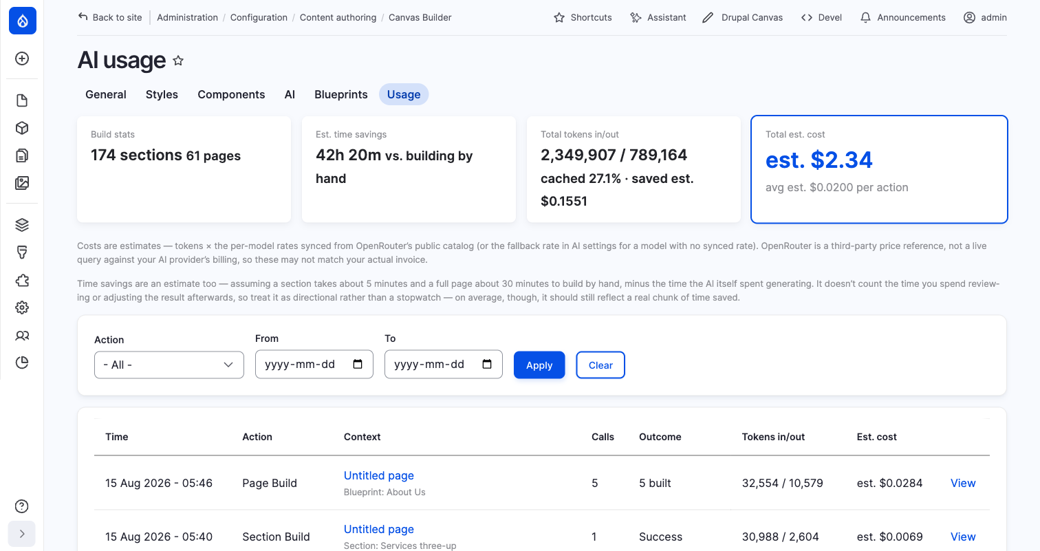
Configuration → Content authoring → Canvas Builder → AI → Usage — every generation logged, filterable by action and date, with a per-model cost estimate.
Setup
Requires the AI module with a configured provider. Two operation types matter:
chat_with_tools— the section-create path, which uses native function calling. It must be a tools-capable model.chat_with_structured_response— everything else.
Check your configured models are current
A provider default pointing at a retired model fails at invoke time with an error that does not obviously name the cause. If generation fails immediately and consistently, verify the model ids in the AI module's settings before looking anywhere else.
Full contracts, endpoints and extension points:
modules/canvas_builder_ai/docs/AI.md and
modules/canvas_builder_ai/docs/SECTION-BLUEPRINTS.md.