Toolbar
Every Section carries a floating, contextual toolbar — it appears the instant a Section is selected (or hovered) and sits anchored above it. It's the primary way you shape a page's structure: width, height, columns, gaps, alignment, and section-level settings, all without opening a form. It's a different surface from the Style panel — the toolbar shapes the band and its layout, Style shapes background, spacing, and typography.
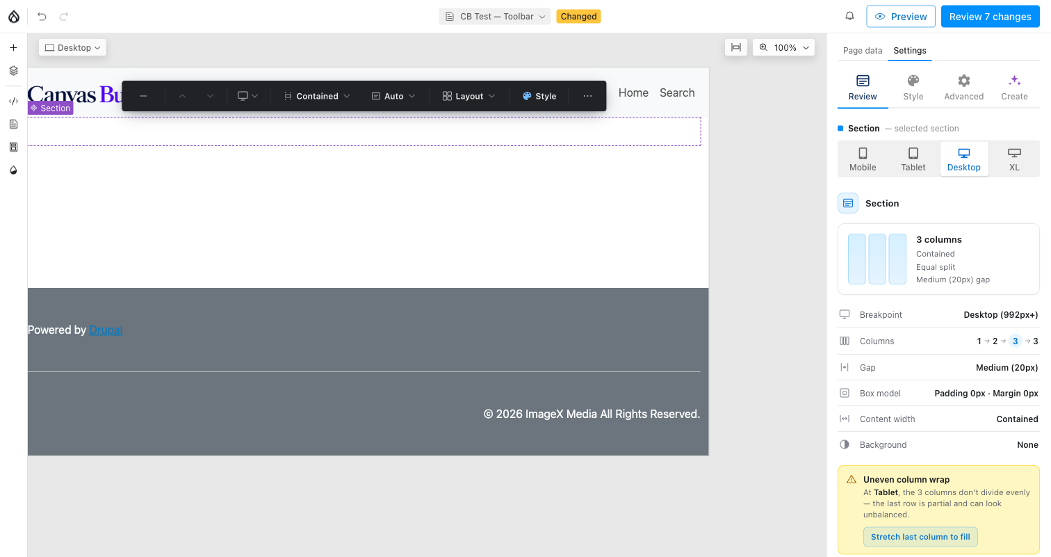
The toolbar over a selected Section, with the Review panel's live summary alongside it.
Choosing a starting layout
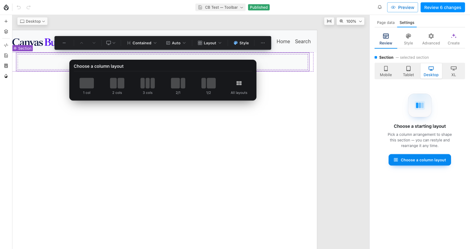
A freshly added Section has no columns yet. Selecting it surfaces an in-canvas "Choose a column layout" picker — 1 / 2 / 3 columns, a 2:1 split, or the full layout gallery (All layouts, including any section templates an admin has defined) — plus the same prompt in the Review tab. Pick one to start; every value it sets can be changed later from the toolbar itself.
The chips
Reading left to right: minimize (collapses the bar to a small pill — click it again to re-expand), move up / move down (reorders this Section among its siblings), a viewport chip (switches which breakpoint every per-viewport control below reads and writes — the same device set as the Style panel's picker), then the settings chips below, and finally ⋯ More.
Width, Height, and Layout are always present. Gap and Arrange live inside the Layout popover rather than as their own chips, and Layout's Arrange sub-tab only appears once there's something to arrange (a single column still shows Gap, since gap also spaces stacked content within one column).
Width
Backing field: container_type (narrow / contained / full /
breakout).
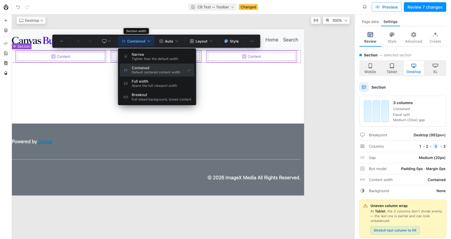
- Narrow — tighter than the default content width.
- Contained — the default centered content width.
- Full width — spans the full viewport.
- Breakout — full-bleed background with boxed content, for a photo or color band that should touch both edges while text inside stays readable.
Width is intentionally not per viewport — one band width applies across all breakpoints.
Height
Backing fields: height (auto / full / min / custom) and
height_value (a CSS length, only used by min / custom).
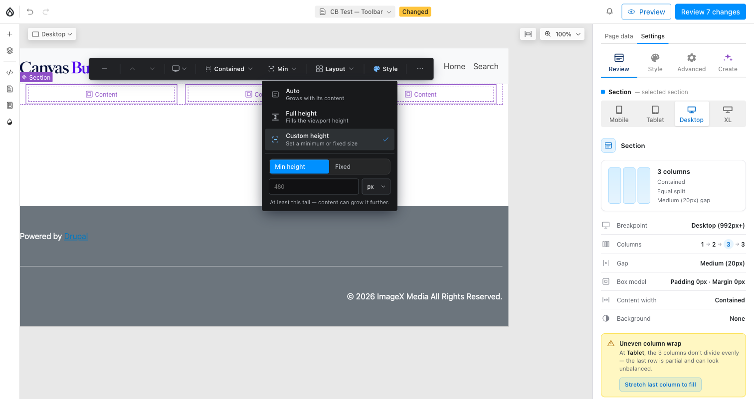
- Auto — grows with its content (the default).
- Full height — fills the viewport height.
- Custom height — reveals a Min height ↔ Fixed toggle plus a value +
unit field (
px,%,vh,dvh). Min height sets a floor the content can still grow past; Fixed pins an exact height and content may overflow it.
Height is also not per viewport. full_height is a legacy boolean
superseded by height == 'full' — the toolbar clears it automatically on any
Height pick so old and new content never fight over which one wins.
Layout — Structure / Arrange / Spacing
A single popover with up to three tabs, all keyed to the active viewport (count, layout preset, gap, align, and column order are per-viewport families — a mobile-first cascade, same as every other responsive value in this module).
Structure — backing fields layout_type, count / count_auto,
layout, min_item_width:
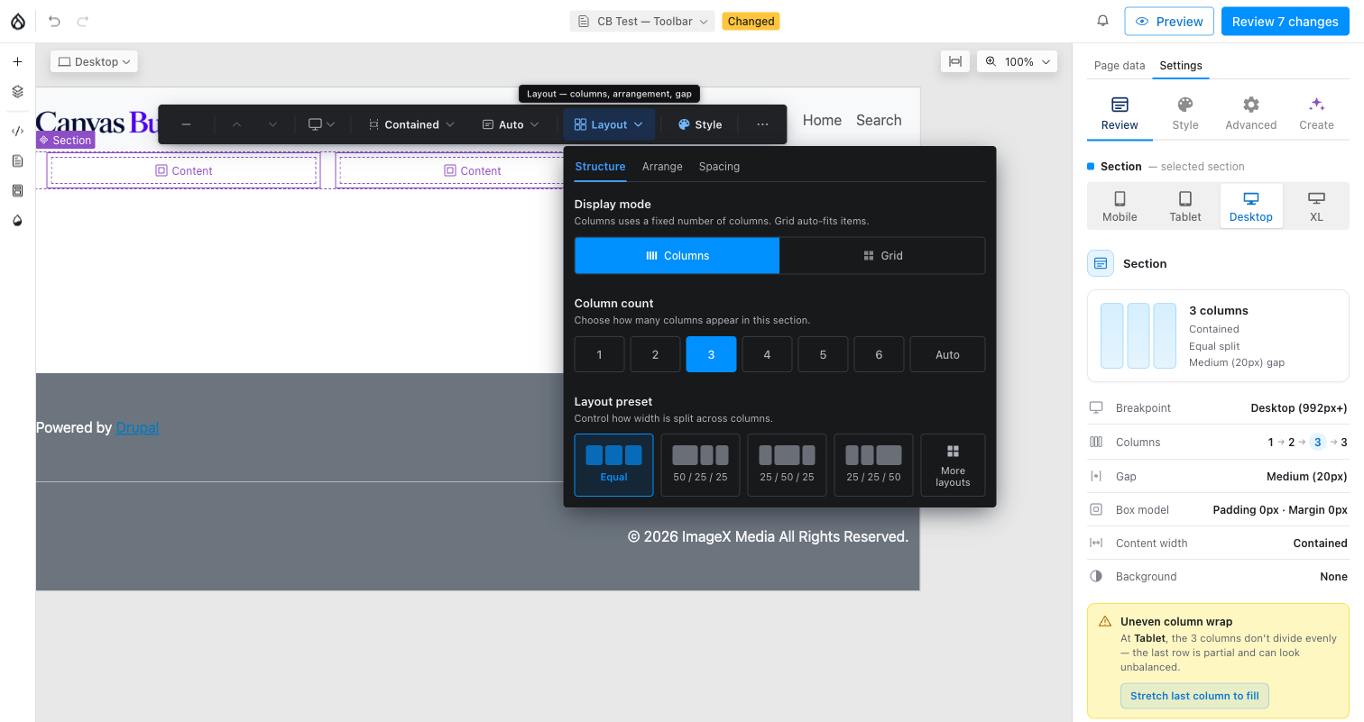
- Display mode — Columns (a fixed count, side by side) or Grid (auto-fits items to a minimum width, wrapping as needed).
- Column count — 1 up to the configured maximum (
layout_defaults.columns.max_countand its per-viewportvp_max_*caps, admin-configurable), or Auto. - Layout preset — how width splits across columns (Equal, 50/25/25, …). Hidden once count is 1 or Auto. More layouts opens the same gallery as the empty-state chooser above, with every built-in and admin-defined template.
- Min column width (Grid, or Columns + Auto) — the width a column must keep before the row wraps to fewer columns.
Arrange — backing fields valign / halign (Columns mode) or
grid_valign / grid_halign (Grid mode), plus reverse:
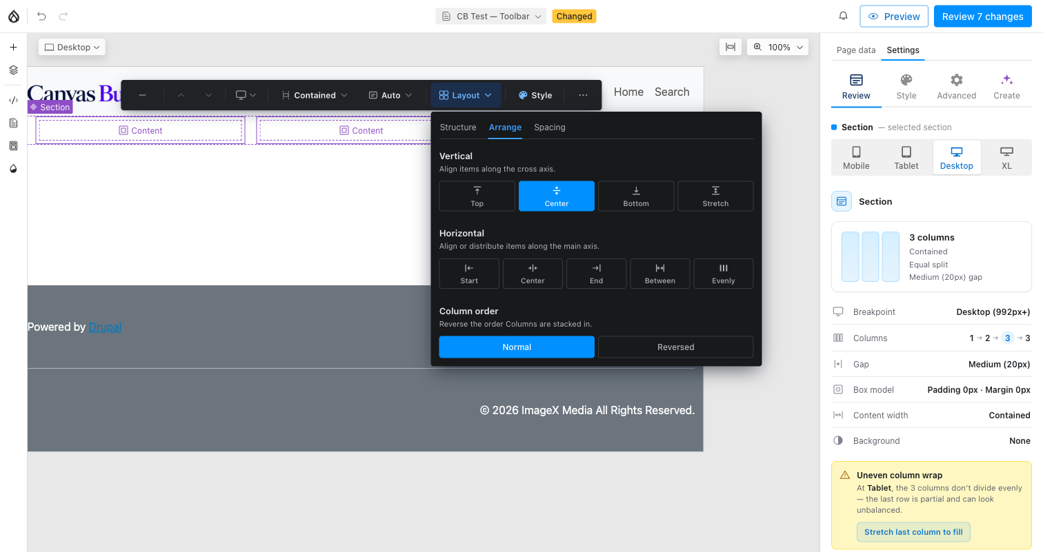
- Vertical / Horizontal align — how columns sit within their row when the row is taller or wider than their content. Reachable even at a single visual column (a full-height section with one column still has a cross-axis to align along).
- Column order — visually reverses the Section's physical Column children (e.g. image-first on desktop, text-first on mobile) without touching source/reading order for assistive tech.
Spacing — backing field gap (none / sm / md / lg / xl,
0 / 8 / 16 / 32 / 48px):
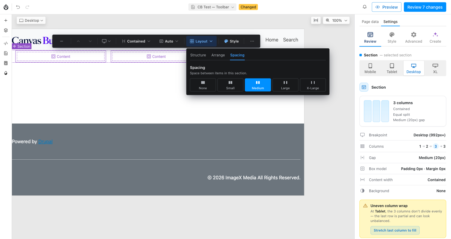
Gap spaces both the columns from each other and components stacked
inside a single column (.cb-col-slot), so it stays reachable at any column
count.
Style
A handoff chip, not a popover — it opens the right-hand panel's Style
tab (Background / Spacing / Typography, and Animation if
canvas_builder_animate is enabled). See Styles for what lives
there; the toolbar only shapes the band and its columns.
⋯ More
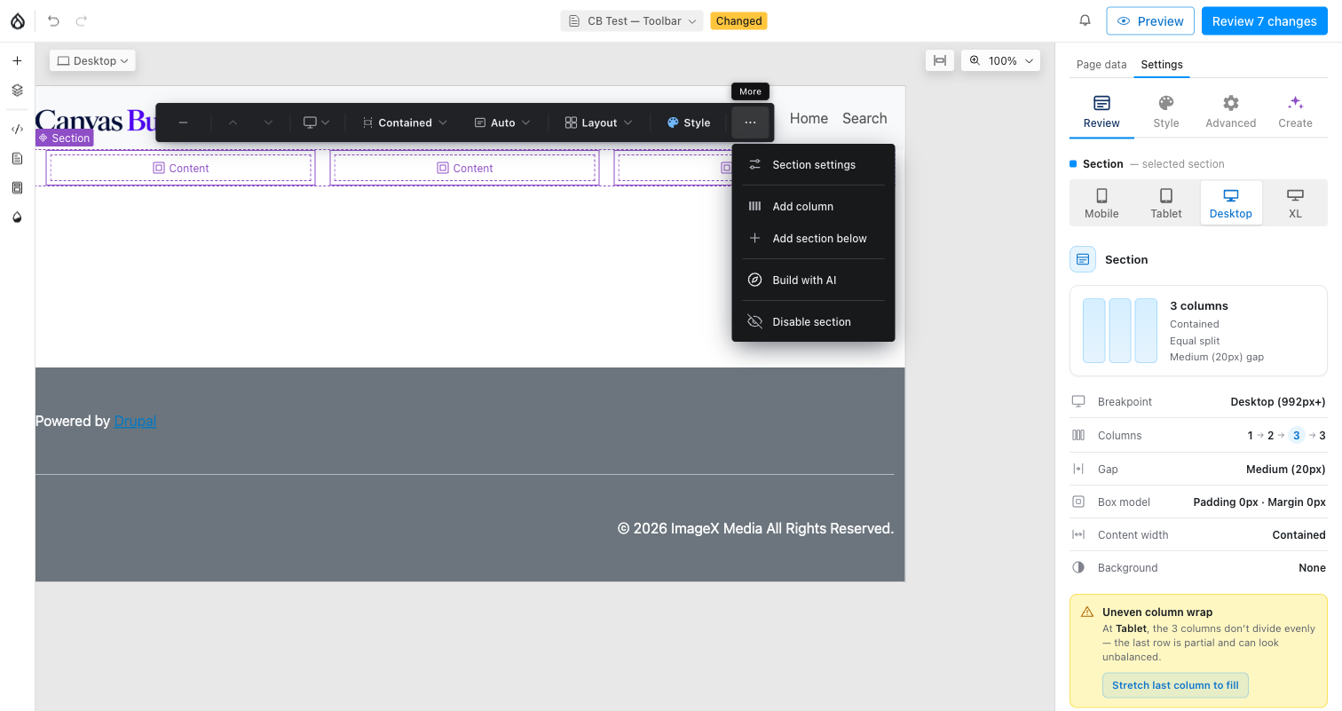
- Section settings — opens the popover below.
- Add column — appends one more column (up to the configured max), identical to the "+ Column" primary action that otherwise sits on the bar itself once there's room for another column.
- Add section below — inserts a new empty Section immediately after this one.
- Extension items — other modules can register additional chips or menu
rows here (documented contract, Events);
canvas_builder_aiadds Build with AI this way. - Disable / Enable section — toggles
section_disabled. A disabled section never renders on the front end; in the editor it's still visible, overlaid with a hatched indicator.
Section settings
Backing fields: tag, section_id, section_classes, and the four
hide_at_{viewport} booleans.
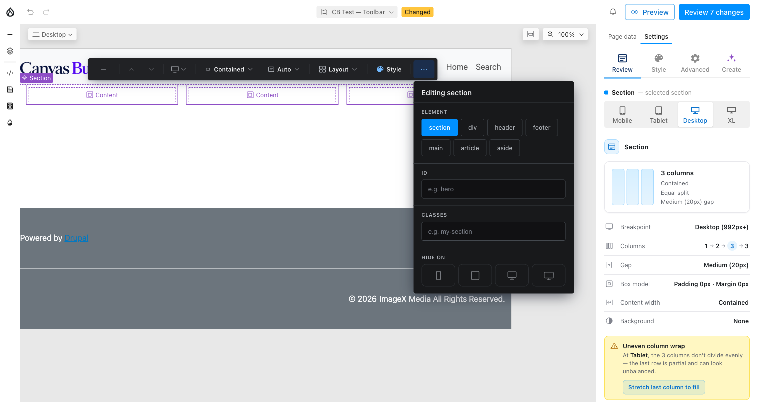
- Element — the semantic HTML tag the Section band renders as.
- ID / Classes — the section element's
idattribute and any extra CSS classes. - Hide on — per-viewport visibility, independent per breakpoint (no mobile-first cascade — each toggle stands alone). A hidden banner appears in the editor canvas when the active viewport is one you've hidden.
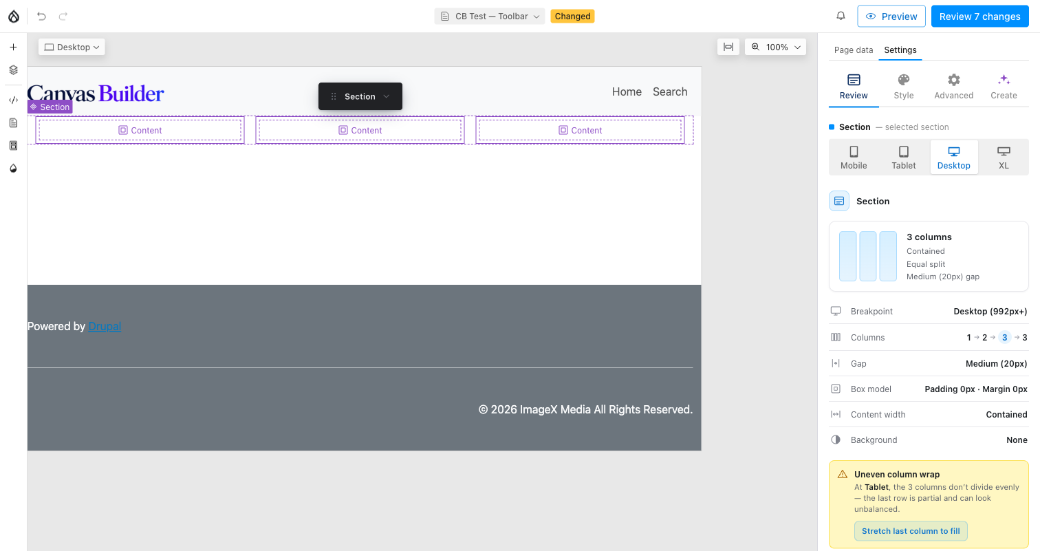
Collapsed toolbar
Clicking minimize shrinks the bar to a small "Section" pill so it stays
out of the way while you work on content beneath it; clicking the pill
re-expands the full bar. The preference is remembered for the session (not
just this one Section) via sessionStorage.
The Review panel
The Style panel's Review tab (next to Style / Advanced / Create) opens with a read-only, at-a-glance summary of the selected Section, all reflecting the active viewport: a mini layout diagram, the column count cascade across every breakpoint (mobile → large desktop), gap, box model (padding/margin, read from the real rendered element), content width, and background. A brand-new, still-empty Section shows the "Choose a starting layout" prompt here instead (see above).
When a breakpoint's column count doesn't divide evenly (e.g. 3 columns at a
count whose wider sibling has more), the Review panel flags an Uneven
column wrap warning with a one-click Stretch last column to fill
action — it sets fill_last, which stretches the last column to fill the
remainder of its row at just the affected breakpoints, computed in pure CSS
per viewport.
Admin settings
Everything the toolbar offers is seeded, capped, or made available for
editing from Configuration → Content authoring → Canvas Builder
(/admin/config/content/canvas-builder, the General tab — a peer of
Styles / Components / AI / Blueprints / Usage), behind the Administer
Canvas Builder permission. The tab is a vertical-tabs form
(GeneralSettingsForm) over the canvas_builder.settings config object,
with six sub-tabs:
- Framework — the active profile radio (Custom / Bootstrap 5 / Tailwind) and the Tailwind Safelist viewer. Covered in Frameworks; it's the same page, just a different tab.
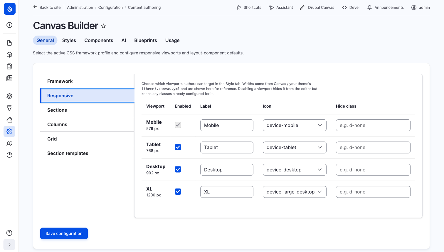
- Responsive — which viewports the toolbar's device chip (and the Style
panel's device picker) offers, plus each one's label, icon, and the CSS
class applied when it's hidden (
hide_at_*). Widths themselves are read-only here — they come from Canvas / your theme's{theme}.canvas.yml; disabling a viewport hides it from the editor but keeps any classes already configured for it. The base (narrowest) viewport can't be disabled — every other viewport's mobile-first cascade inherits from it.
- Sections —
layout_mapsclass-mapping tables for the Section band (width, height, alignment): one framework class per value × viewport, live under aclassesengine (Bootstrap/Tailwind), inert under the defaultcss_varsengine. See Frameworks → Layout class maps. - Columns — the toolbar's actual defaults and caps, plus the Columns
family's own
layout_mapstables (count, gap, align, column order):
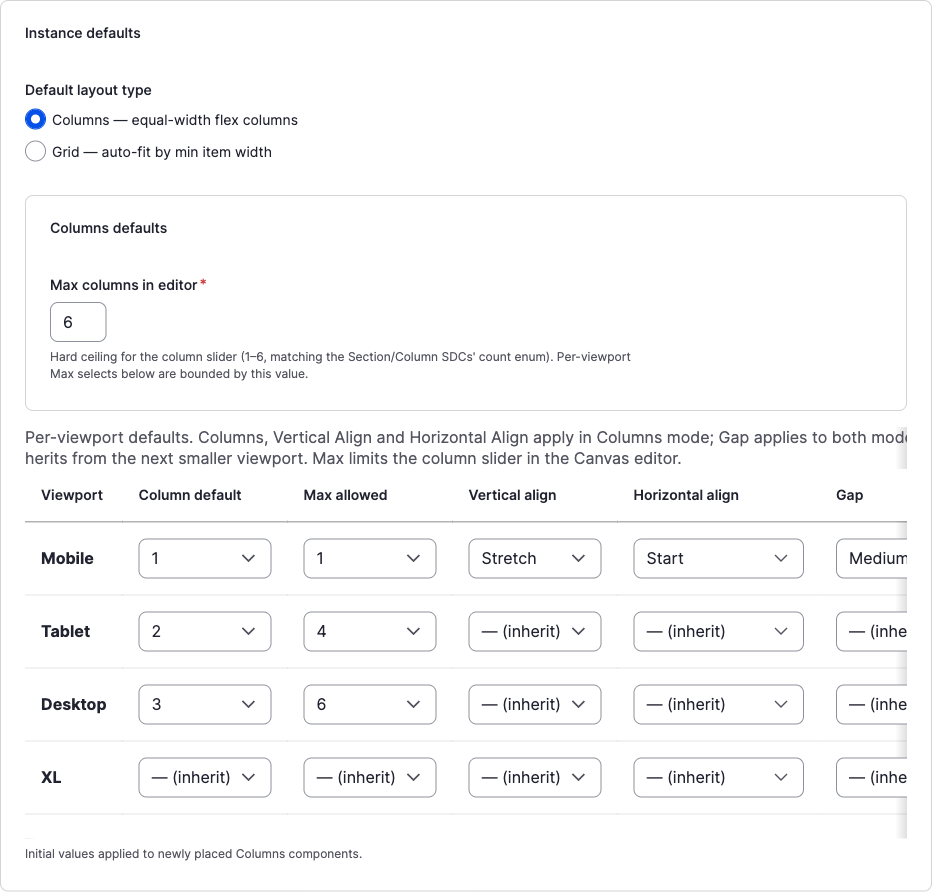
- **Default layout type** — Columns or Grid, applied to every newly
  placed Section.
- **Max columns in editor** (`layout_defaults.columns.max_count`) — the
  hard ceiling (1–6) for the toolbar's Structure-tab column-count row and
  the "+ Column" action; every per-viewport **Max allowed** below is
  bounded by it.
- The **per-viewport table** — **Column default** (the count a new
  Section starts with at that breakpoint), **Max allowed** (`vp_max`, a
  per-viewport ceiling beneath the global max), **Vertical align**,
  **Horizontal align**, and **Gap** — the seed values for `valign`,
  `halign`, and `gap` a freshly placed Section carries before an author
  touches the Arrange/Spacing tabs. Every column past the base viewport
  defaults to **— (inherit)**, matching the mobile-first cascade the
  toolbar itself reads at render/edit time.
- Grid — a pointer note (Grid shares the Columns tab's instance
defaults) plus a free-text Grid minimum-item-width list and the Grid
family's own
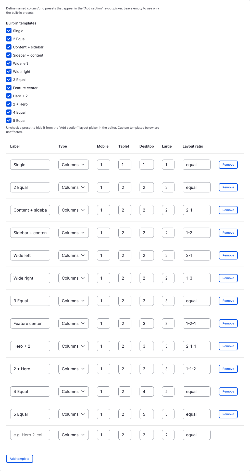
layout_mapstables (grid alignment). The toolbar's own Min column width pills (100–400px) come from the Section SDC's fixed prop enum, not from this list. - Section templates — checkboxes to hide any of the 12 built-in layout
presets from the toolbar's "Choose a column layout" chooser and "More
layouts" gallery, plus a table to define custom named presets (label,
Columns/Grid, a per-viewport column count, and a layout ratio like
2-1). Every built-in also appears as an editable/removable row here — the checkboxes above only control chooser visibility, not these rows.
How this plays with your framework
All Section/Column layout — count, gap, alignment, height — renders through the layout engine set by your active framework profile, completely independent from the toolbar UI itself:
- Custom (
css_vars, default) — every value above becomes a CSS custom property (--cb-columns-count,--cb-gap,--cb-valign, …) and Columns / Grid always render on plain CSS Grid, regardless of profile. Nothing here requires or emits framework classes. - Bootstrap 5 / Tailwind (
classes) —layout_mapsadditionally emits one mapped utility class per resolved value at each viewport (e.g.columns.gap.lg.tablet → gap-md-4), gated behind adata-cb-*-engineattribute so the utility class — not the CSS-var fallback — wins in the generated cascade CSS. Column count itself is never emitted as a class (it's inherently per-viewport, which one class per enum value can't express); Width and the class-mappable Height modes (auto,full) are base-only, since they're not meant to vary per breakpoint.
Because Columns/Grid always use CSS Grid rather than a framework's own grid
system (Bootstrap's .row/.col fights Canvas's slot model), switching
frameworks changes which utility classes ride alongside the layout, never
the layout mechanics themselves. See
Frameworks → Layout class maps for the
full per-family mapping table, and the
Tailwind safelist if you're on a purging
Tailwind build — the toolbar's runtime-derived classes need to be told to
your build the same way the Style panel's per-side spacing classes do.