Targets and effects
Pick what moves, then how it moves — the two things every animation starts with.
Choosing a target
The chip at the top of the panel is a breadcrumb — it always names the section first, so you know where you are on a page with several.
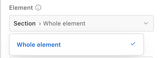
What it offers depends on what you selected:
- From a section — the section itself, each of its columns, and All columns (staggered) when two or more columns have no animation yet.
- From a component — Whole element, plus any parts that component's template has explicitly marked as animatable (component authors: see Named targets).
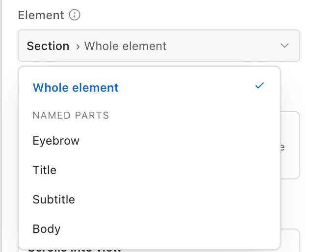
A section's chip deliberately does not list every heading and image buried inside its columns. To animate one of those, click it on the canvas — the panel follows your selection.
Staggering all columns
All columns (staggered) creates one animation per column and offsets each one slightly, so they arrive in sequence rather than together. It appears only when at least two columns are still free, and it never doubles up on a column that already has an animation.
Choosing an effect
Change on the effect card opens the drawer: a search box, category chips, and a grid of tiles. Hover a tile and it plays a small preview of what it does.
An effect is a named bundle of values, not a label. Picking Fade up sets direction, distance, opacity, duration and easing together. Only the effect's id is stored, so retuning it in settings updates every component using it.
Beyond the entrance, scroll and text effects, the catalog ships a set of declared-motion effects that need no direction or distance: Flip, Rotate, Mask reveal, Expand to full bleed, Counter zoom, and Progress bar.
Effects that the target cannot support are shown disabled with the reason rather than hidden — see Motion → When an effect is unavailable.
All effects
Fade up
Entrance
Fades in while rising a short distance from below.
Slide in
Entrance
Slides in from the edge of its container.
Zoom
Entrance
Grows from a smaller size up to full scale.
Flip
Entrance
Turns into view like a card flipping face-up.
Rotate
Entrance
Turns into place from a slight angle.
Bounce
Entrance
Arrives with a springy overshoot before settling.
Staggered reveal
Entrance
Reveals each child in sequence, one after another.
Draw in
Draw
Draws the stroke of an SVG path from start to end.
Parallax drift
Scroll-linked
Drifts at a different speed than the page as you scroll past it.
Line reveal
Text
Splits text into lines and reveals them one at a time.
Words rise on scroll
Text
Splits text into words that rise into place as you scroll.
Character reveal
Text
Splits text into characters that fan in, tied to scroll progress.
Pinned reveal
Scroll-linked
Pins in place while its children reveal, then releases.
Horizontal scroll
Scroll-linked
Tracks sideways across the viewport as the page scrolls.
Mask reveal
Scroll-linked
Wipes open from a tight crop to the full frame as you scroll past.
Expand to full bleed
Scroll-linked
Grows from a narrow column out to the full width of the page.
Counter zoom
Scroll-linked
Starts overscaled and settles back to true size — pairs with a mask or a parent that moves.
Progress bar
Scroll-linked
Fills from left to right in step with how far the page has scrolled.
Saving your own effect
Tuned something you want again? Save as effect at the bottom of the Customize panel captures every override currently set — direction, distance, duration, easing, stagger, split, all of it — under a name you choose. This is the fastest way to add a custom effect: build an animation in the editor, open Customize, and save it — no admin form needed.
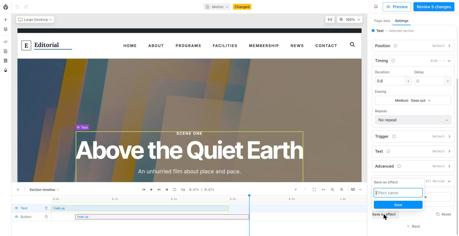
Saved effects appear in the effect drawer under a ★ Yours category, which shows up once you have saved at least one.