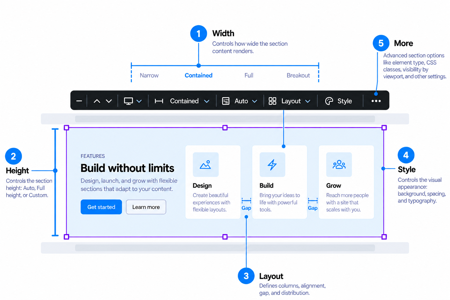
Layout: Structure / Arrange / Spacing
A single popover with up to three tabs, all keyed to the active viewport (count, layout preset, gap, align, and column order are per-viewport families, a mobile-first cascade like every other responsive value in this module).
Structure
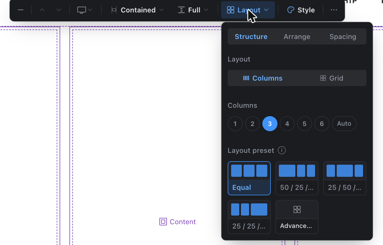
- Display mode: Columns (a fixed count, side by side) or Grid (auto-fits items to a minimum width, wrapping as needed).
- Column count: 1 up to the configured maximum (
layout_defaults.columns.max_countand its per-viewportvp_max_*caps, admin-configurable), or Auto. - Layout preset: how width splits across columns (Equal, 50/25/25, …). Hidden once count is 1 or Auto. More layouts opens the same gallery as the empty-state chooser, with every built-in and admin-defined template.
- Min column width (Grid, or Columns + Auto): the width a column must keep before the row wraps to fewer columns.
Arrange
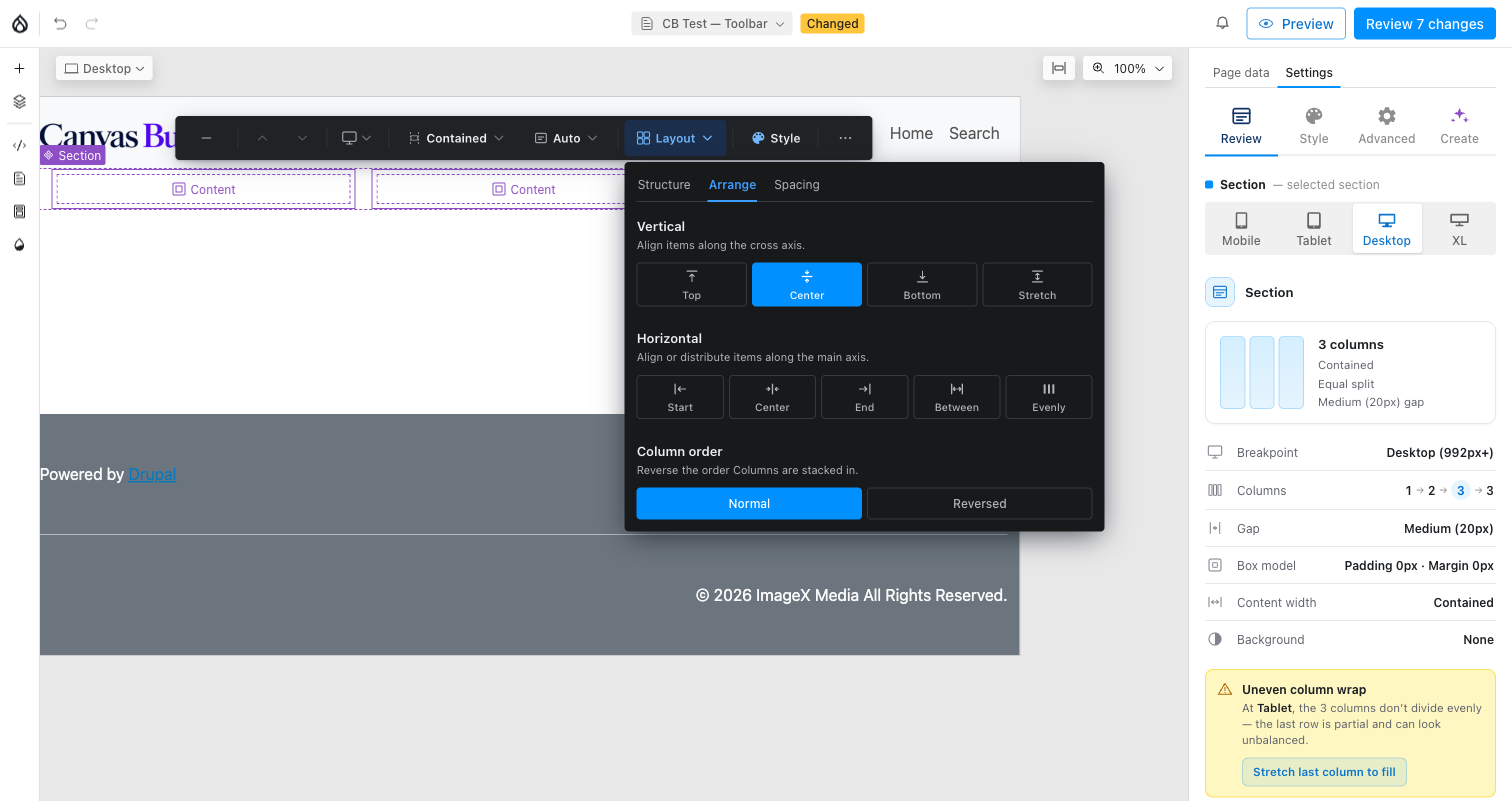
- Vertical align — Top / Center / Bottom, how columns sit within their row when it's taller than their content. Reachable even at a single visual column (a full-height section with one column still has a cross-axis to align along).
- Stretch vertically — a toggle, not a fourth align option: on, the column fills the row's full height and Vertical align has nothing left to pick, so its row disables; off, Vertical align resumes from wherever it last sat.
- Horizontal align — Start / Center / End, position within the row. Disables (with a note) whenever Distribution on the Spacing tab isn't Normal — both write the same underlying field, one value at a time.
- Column order — visually reverses the Section's physical Column children (e.g. image-first on desktop, text-first on mobile) without touching source/reading order for assistive tech.
Spacing
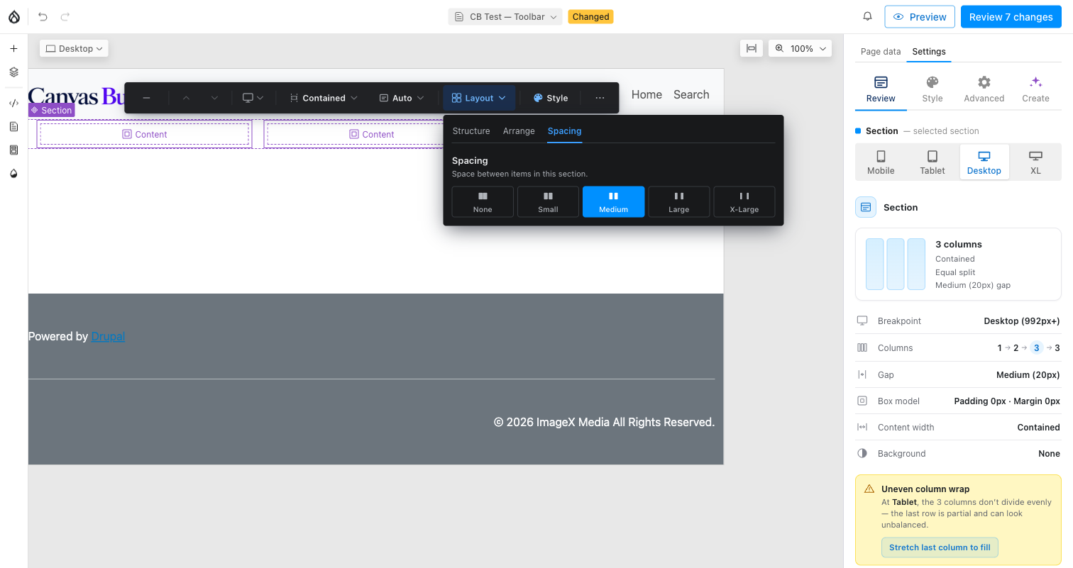
- Gap spaces both the columns from each other and components stacked
inside a single column (
.cb-col-slot), so it stays reachable at any column count. - Distribution — Normal / Between / Evenly. This and Horizontal align (Arrange tab) are two views onto the same field: picking Between or Evenly here is what disables Horizontal align there, and picking Normal restores whichever Start/Center/End position was last set. Not shown in Grid mode.
See Toolbar → Backing fields for exactly which SDC props each Layout control writes.