Toolbar
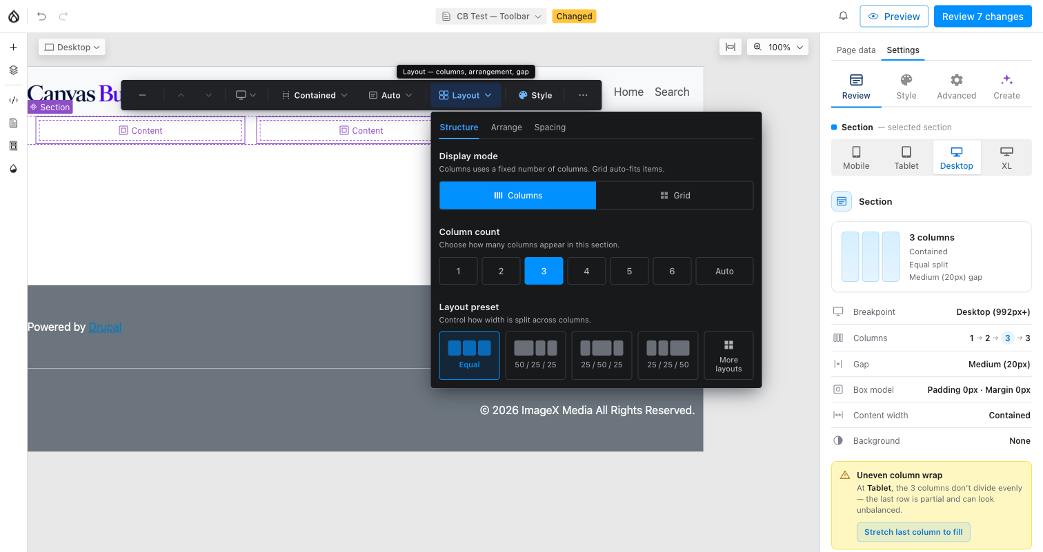
Layout, actions, and section tools — the floating toolbar's band and column controls.
Overview
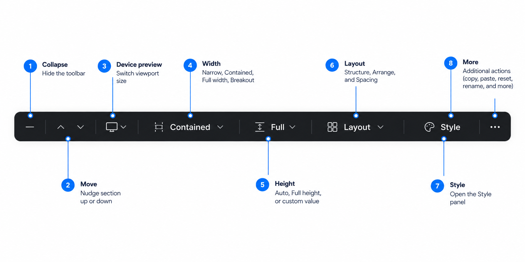
A floating toolbar appears the instant you select or hover a Section. It shapes the section's band and layout — width, height, columns, gaps, alignment.
For background, spacing, and typography, see Style.
Width
Narrow, Contained, Full width, Breakout.
Height
Auto, Full height, or a custom value.
Layout
Structure, Arrange, and Spacing tabs.
Style
Hands off to the Style panel.
In the editor
1 Pick a starting layout
A freshly added Section has no columns yet. Selecting it (or clicking the + on a blank page) surfaces an in-canvas layout picker — pick one to start, and change any of it later from the toolbar itself.
2 Adjust columns per viewport
Each visual column is a real Column child component. The toolbar's
per-viewport controls, and the Review panel's live breakdown, follow the
active device.
3 Select a nested parent
Double-click a selected component to jump to the component it lives in, and keep double-clicking to keep walking up — useful when a child fills its whole area and leaves nothing else to click.
Main controls