Width and height
Width
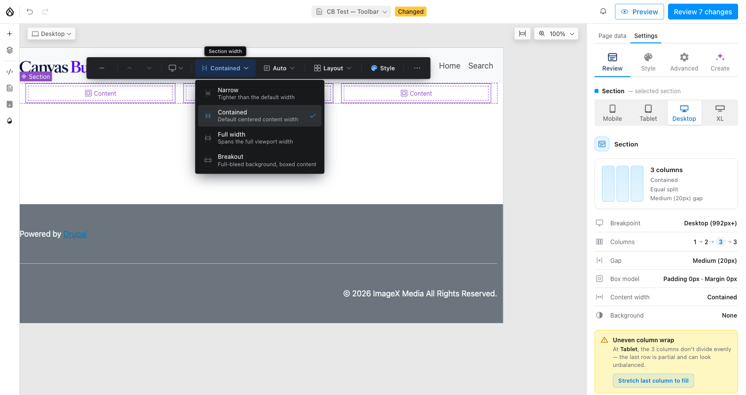
- Narrow: tighter than the default content width.
- Contained: the default centered content width.
- Full width: spans the full viewport.
- Breakout: full-bleed background with boxed content, for a photo or color band that should touch both edges while text inside stays readable.
Width is intentionally not per viewport: one band width applies across all breakpoints.
Height
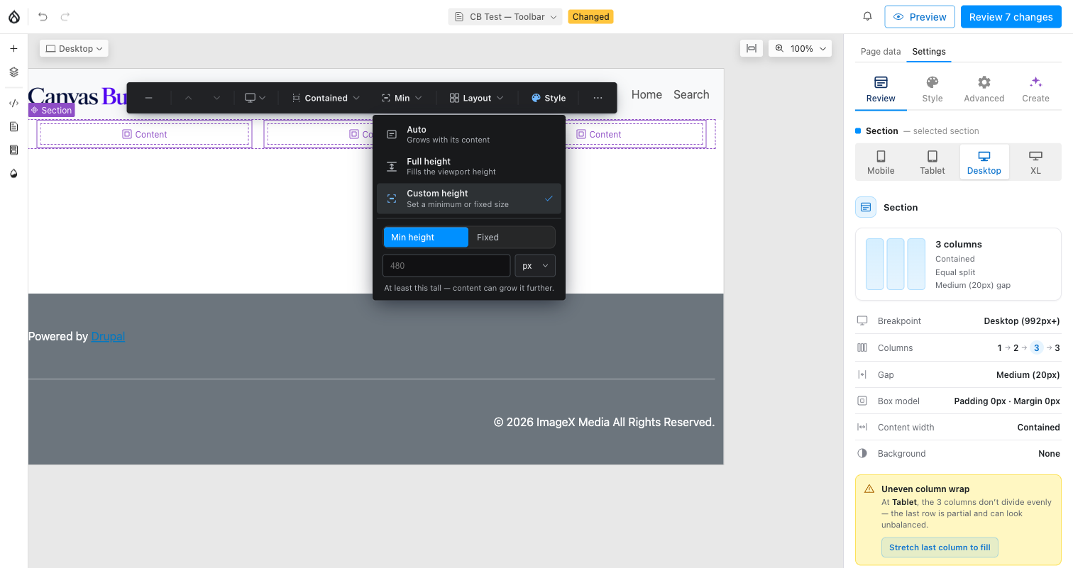
- Auto: grows with its content (the default).
- Full height: fills the viewport height.
- Custom height: reveals a Min height ↔ Fixed toggle plus a value +
unit field (
px,%,vh,dvh). Min height sets a floor the content can still grow past; Fixed pins an exact height and content may overflow it.
Height is also not per viewport. The section also carries an internal
full_height boolean prop, which the toolbar always keeps in sync with
height, clearing it on any Height pick, so the two can never disagree.