Style
Background, spacing, and typography for sections, columns, and components.
Overview
Every component gets a Style tab with Background, Spacing, and Typography groups. It shapes appearance, not layout.
For a Section's band and column layout, see Toolbar.
- Works with Bootstrap, Tailwind, or a custom framework
- Every value is set per viewport
- Saves instantly — no confirm step
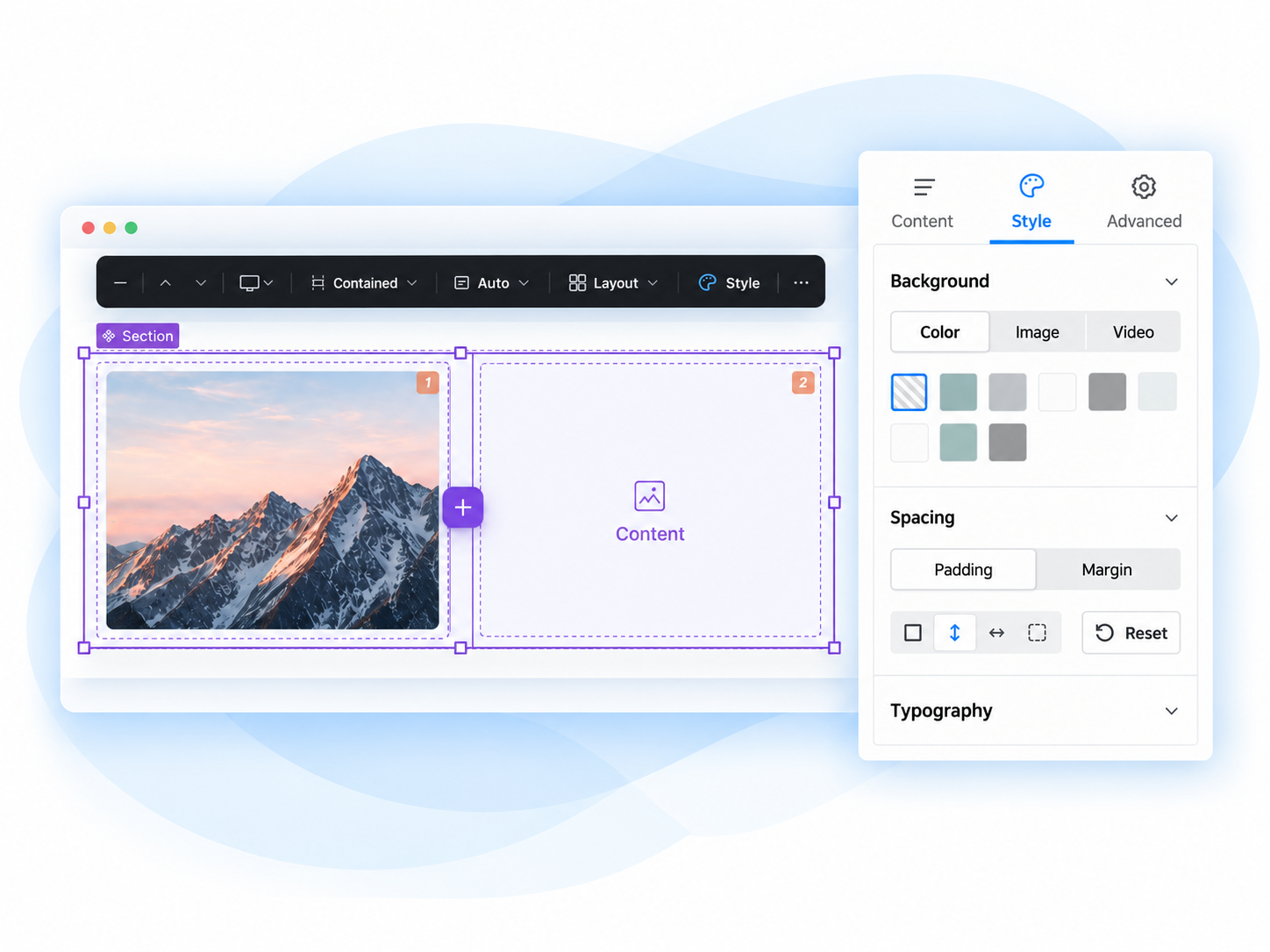
Background
Colour, image, or video, plus an overlay.
Spacing
Padding and margin, per side.
Typography
Heading scale, text colour, alignment.
Extending
New options, groups, or widgets.
In the editor
1 Every component gets a Style tab
Props are organized into Content / Style / Advanced tabs automatically, from a YAML annotation on the component — no custom form code needed.
2 Pick a viewport
Every value below is per viewport. Switching the device picker in the toolbar re-points every style control to that viewport's stored value.
3 Adjust a property group
Open Background, Spacing, or Typography in the Style tab and change a value — it applies instantly and rides Canvas's own draft → publish → revision lifecycle.
Common tasks
Settings & advanced details
Enabling or disabling individual style options, config keys with no admin form, and a full technical reference for each style group — seeded defaults per framework, and how to extend the system.