Admin settings
Everything the toolbar offers is seeded, capped, or made available for
editing from Configuration → Content authoring → Canvas Builder
(/admin/config/content/canvas-builder, the General tab, a peer of
Styles / Components / AI / Blueprints / Usage), behind the Administer
Canvas Builder permission. The tab is a vertical-tabs form
(GeneralSettingsForm) over the canvas_builder.settings config object,
with six sub-tabs:
- Framework: the active profile radio (Custom / Bootstrap 5 / Tailwind) and the Tailwind Safelist viewer. Covered in Frameworks; it's the same page, just a different tab.
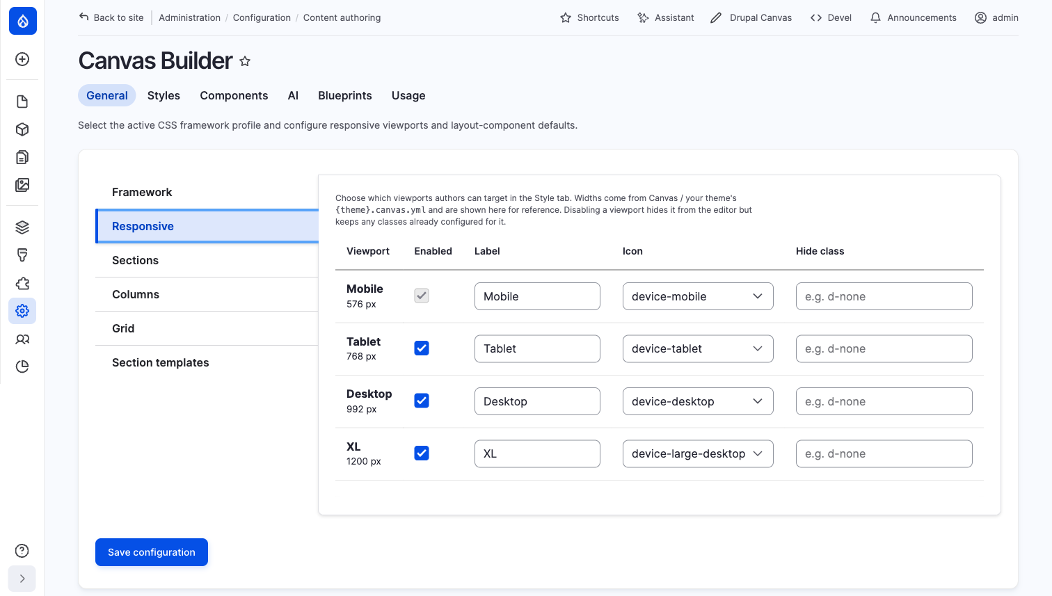
- Responsive: which viewports the toolbar's device chip (and the Style
panel's device picker) offers, plus each one's label, icon, and the CSS
class applied when it's hidden (
hide_at_*). Widths themselves are read-only here; they come from Canvas / your theme's{theme}.canvas.yml. Disabling a viewport hides it from the editor but keeps any classes already configured for it. The base (narrowest) viewport can't be disabled: every other viewport's mobile-first cascade inherits from it.
- Sections:
layout_mapsclass-mapping tables for the Section band (width, height, alignment): one framework class per value × viewport, live under aclassesengine (Bootstrap/Tailwind), inert under the defaultcss_varsengine. See Frameworks → Layout class maps. - Columns: the toolbar's actual defaults and caps, plus the Columns
family's own
layout_mapstables (count, gap, align, column order):
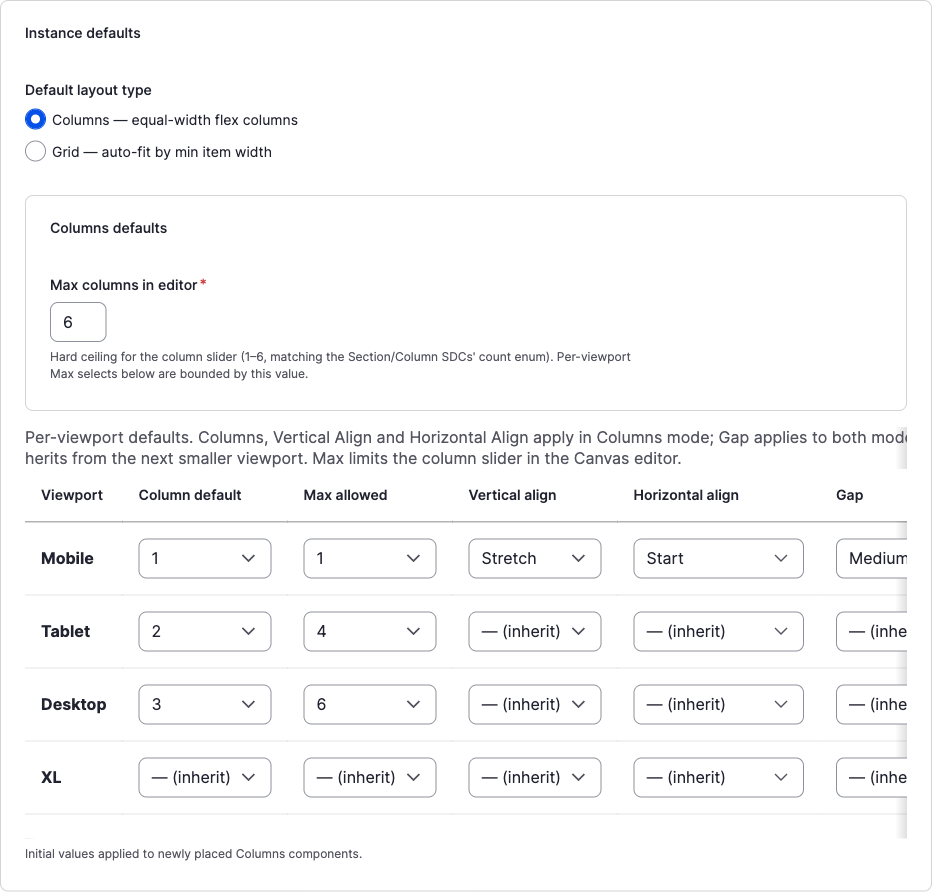
- **Default layout type**: Columns or Grid, applied to every newly
  placed Section.
- **Max columns in editor** (`layout_defaults.columns.max_count`): the
  hard ceiling (1–6) for the toolbar's Structure-tab column-count row and
  the "+ Column" action; every per-viewport **Max allowed** below is
  bounded by it.
- The **per-viewport table** lists **Column default** (the count a new
  Section starts with at that breakpoint), **Max allowed** (`vp_max`, a
  per-viewport ceiling beneath the global max), **Vertical align**,
  **Horizontal align**, and **Gap**: the seed values for `valign`,
  `halign`, and `gap` a freshly placed Section carries before an author
  touches the Arrange/Spacing tabs. Every column past the base viewport
  defaults to **— (inherit)**, matching the mobile-first cascade the
  toolbar itself reads at render/edit time.
- Grid: a pointer note (Grid shares the Columns tab's instance
defaults) plus a free-text Grid minimum-item-width list and the Grid
family's own
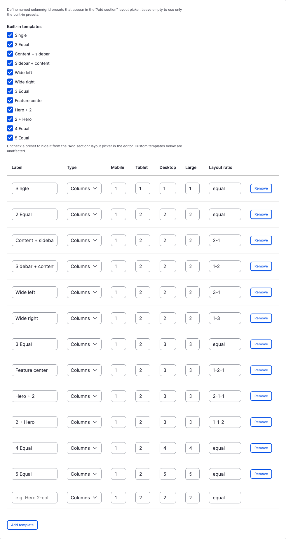
layout_mapstables (grid alignment). The toolbar's own Min column width pills (100–400px) come from the Section SDC's fixed prop enum, not from this list. - Section templates: one table, one row per layout preset (the 12 built-ins, in order, then any custom ones), each with an Enabled checkbox controlling whether it appears in the toolbar's "Choose a column layout" chooser and "More layouts" gallery. Built-in rows are always present and tunable (label locked; Type/Mobile/Tablet/Desktop/Large/Layout ratio editable) but not removable, only turned off. Custom rows add every field including the label, plus a Remove button. A row whose column count exceeds the Columns tab's Max columns in editor value is force-disabled, with the reason shown inline next to its checkbox.